Geopolitical risk now restrains corporate borrowing more than interest rates
Asian firms delay investment when trade and policy rules become unpredictable
Stable policy signals matter more than cheaper credit for reviving investment
Sanctions are no longer fully isolating North Korea as its nuclear program advances
This normalization weakens global non-proliferation norms
The shift raises nuclear pressure on U.S.
Markets price geopolitical risk long before models can measure it
Local-language news captures early signals that global indices miss
LLMs can structure these signals, if used with care and oversight
Fewer Than One in Five: Why the AI Hype Still Misses Most European Workplaces
Picture
Member for
1 year 8 months
Real name
Ethan McGowan
Bio
Professor of AI/Finance, Gordon School of Business, Swiss Institute of Artificial Intelligence
Ethan McGowan is a Professor of AI/Finance and Legal Analytics at the Gordon School of Business, SIAI. Originally from the United Kingdom, he works at the frontier of AI applications in financial regulation and institutional strategy, advising on governance and legal frameworks for next-generation investment vehicles. McGowan plays a key role in SIAI’s expansion into global finance hubs, including oversight of the institute’s initiatives in the Middle East and its emerging hedge fund operations.
Published
Modified
AI adoption in Europe is still limited, with most firms using AI only as a supporting tool
The gap between AI hype and real workplace use reflects risk, skills gaps, and institutional limits
Policy and education must focus on practical capacity, not promises of rapid transformation
In 2025, less than one in five European companies says they formally use artificial intelligence. This number paints a more realistic picture than the idea of a fast-paced move toward automation, and it brings up a valid question for those who make policy and teach: If AI is truly changing work, why isn't it used in most workplaces? The answer isn't resistance or lack of awareness, but rather has to do with structure. Across Europe, AI use is inconsistent, basic, and often just for show. Many companies use AI as a tool, not as a core system. This difference between what people think and what's really happening is important now because policies, funding, and training plans are starting to assume that AI is everywhere already. They're being created for a future that isn't here yet. Until we recognize what AI use in Europe actually looks like, investments will continue to reward hype over real work, and training programs will prepare workers for tools they may never need.
AI use in Europe: what the numbers tell us
Recent surveys of businesses across the European Union show a common theme. About 20% of companies say they use AI in some form, mostly big companies and those in knowledge-based fields. Among small and medium-sized businesses, where most Europeans work, the numbers are much lower. In some countries, such as Italy, fewer than 1 in 10 companies report using AI. These aren't just unusual cases. They come from official statistics that define AI narrowly and ask companies to report when they intentionally use it, not just when it's part of a software update.
This is an important point. Many companies use digital tools with machine-learning components without calling them AI. At the same time, some companies say they've adopted AI after doing small tests that never became part of their daily work. These things balance each other out. The result isn't exact, but it gives us a good idea of the trend. AI use in Europe is growing, but it's starting from a low base and remains inconsistent across company sizes, industries, and countries.
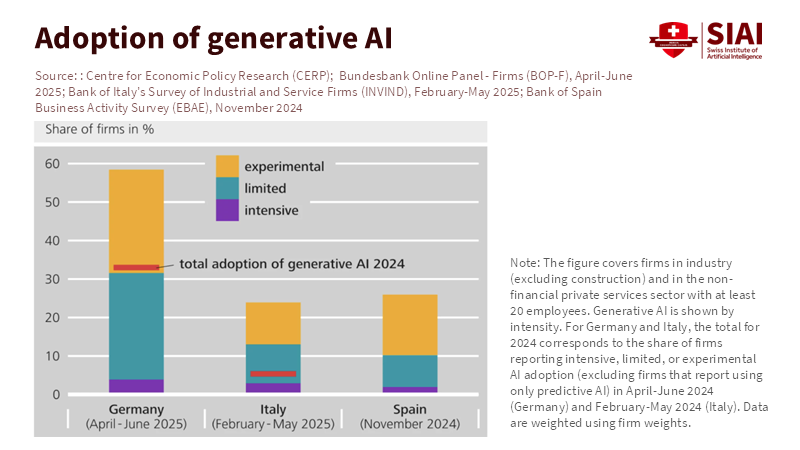
Figure 1: Despite intense public attention, total generative AI adoption remains limited in Germany, Italy, and Spain, with most usage concentrated in experimental or limited applications rather than intensive deployment.
The popular story of quick spread comes from different sources. Consulting surveys and reports from sellers often claim that half or more of companies are using AI, especially generative tools. These surveys often focus on tech leaders, executives at large companies, or early adopters. They measure interest and experiments, not ongoing use. Both views are helpful, but they tell us different things. One tells us how many companies depend on AI as part of their usual work. The other tells us how many are curious or trying things out. Confusing these two can lead to bad policy decisions.
This reality has direct results for those who teach and run programs. Training systems are being changed to focus on general AI knowledge, as if every workplace needs it. But many companies need workers who can judge tools, handle data quality, and use small AI functions in their current work. Teaching advanced AI use without covering these basics could widen the skills gap with employers' needs. The policy challenge is not to assume everyone is using AI, but to help companies move from curiosity to skill.
Why AI is still a helper, not a main system
Across both Europe and the United States, surveys of workers show a similar story. About one in five adults say they use AI tools at work, and even those who do mostly see them as helpers, not replacements. They help write emails, summarize documents, or brainstorm ideas. They rarely control important decisions, schedules, or how things are made. This isn't by chance. It shows how companies handle risk.
Being correct is still the first problem. AI systems, especially general tools, still make confident mistakes. For tasks where mistakes can lead to legal, financial, or safety problems, companies prefer human judgment. Using AI to help write a draft is safe, but using it to make a final decision is not. Until it becomes more reliable or until better ways to assign responsibility emerge, companies will keep AI in low-risk areas.
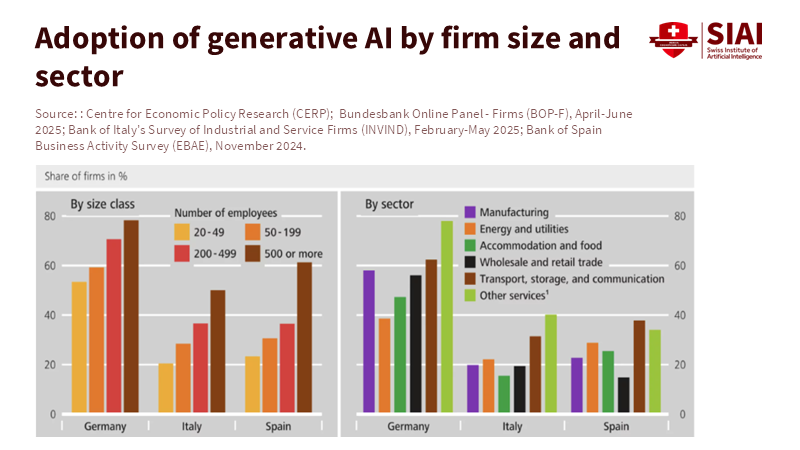
Figure 2: Generative AI adoption rises sharply with firm size and varies widely by sector, reinforcing that AI integration remains a capability issue rather than a universal technological shift.
Skills and the ability to make changes form the second problem. Using AI means having good data, changing processes, and regularly checking on things. Big companies can handle these costs, but most small companies can't. For them, using AI often means buying a ready-made tool that fits into their current work without changing it. This limits how much they can gain, but also how much disruption it causes.
The third problem is uncertainty. Companies face changing rules, unclear responsibilities, and rapidly changing seller options. Tying a key process to a specific AI system feels risky when standards are still changing. Using it a little at a time becomes the logical choice. This is why AI use in Europe seems basic from the outside. It's not because companies don't see the potential, but because they're being careful within their limitations. Policy should start with this understanding, not with frustration.
Critics often point to successful companies that have already changed their operations using AI. These examples exist and are important, but they're not typical. They have strong data systems, skilled workers, and leaders who are willing to change work from the ground up. The danger is creating policies for these exceptions instead of for the average company. When that happens, public money goes to experiments that don't expand.
The policy mistake: thinking use is unavoidable
Many current policies assume that AI use will speed up on its own, as long as rules don't get in the way. This assumption shapes training plans, funding for new ideas, and even job market predictions. But it's wrong. Technology spreading is rarely automatic. It depends on related investments, trust in institutions, and changes in how organizations work. AI is no different. Without help for using it, adoption stops at the test stage. Research shows that gains come not from the technology itself, but from how it changes tasks and decisions.
For education systems, this means a change in focus. Instead of making broad claims about AI-ready graduates, courses should focus on practical skills. Students and workers need to know how to check outputs, handle data, and change workflows to fit imperfect tools. These skills can be used across different platforms and industries, and they're what companies really need.
Government buying offers another way to make a difference. Governments buy a lot of digital systems, but often reward newness instead of use. Contracts should require clear plans for changing workflows, training staff, and measuring results. This would show sellers and companies that AI adoption is not about demos, but about lasting use. There's also a role for shared resources. Many small companies can't afford to hire data engineers or AI checkers. Regional support centers, industry-specific support, and neutral evaluation centers could make adoption more affordable. This isn't old-style industrial policy; it focuses on making adoption possible rather than trendy.
Skeptics say these steps slow the spread of new ideas. But they actually do the opposite. By reducing uncertainty and spreading knowledge, they help more companies move beyond basic use. The alternative is a two-speed economy: a few advanced users and a large group watching from the sidelines.
From hype to habit: what lasting adoption needs
The last change is about culture. AI adoption in Europe is often seen as a competition with other regions. This encourages speed over suitability. A better way to think about it is to form a habit. Companies adopt what they can keep up with. Habits form through repetition, feedback, and trust.
To build these habits, policy should reward consistent use rather than big announcements. Metrics should measure how deeply AI is used, not just if it's present. Education systems should confirm practical skills, not just knowledge of tools. Those who make rules should focus on clarity and fairness to reduce fear of unknown responsibilities.
Teachers, especially, are at a key point. If they teach AI as magic, graduates will expect workplaces that don't exist. If they teach it as a fallible system within social and organizational contexts, graduates will be better prepared for real work. This isn't lowering goals, but redefining what it means to be ready.
The opening number is worth repeating because it sets the foundation for the discussion: less than one in five European companies use AI today. This isn't a failure, but a starting point that yields several key takeaways: current AI use is limited, policy and training should align with actual adoption, and real productivity comes from grounded, step-by-step integration. Policies built on this reality can make AI adoption more meaningful and productive, rather than driven by hype.
Creating a policy for Europe that is
The gap between AI headlines and what's really happening in workplaces isn't going to close on its own. It continues because policies, education, and investments have been built on assumptions rather than facts. AI adoption in Europe remains limited, inconsistent, and largely used as a helper. Pretending otherwise doesn't speed up change, but distorts it. A better way is to start with honesty. The key takeaways are: most companies are cautious with good reason, AI is mostly a workplace helper, and actual productivity depends on how technology is used, not just on exposure to it. Policies that reflect these truths will better support slow, meaningful progress: skills development, thoughtful workflow changes, and building institutional trust. The challenge ahead is not to force adoption, but to make it possible. This means matching education to real needs, government buying to real results, and rules to real risks. If Europe succeeds, it will be because it moved deliberately, not because it moved fastest. The future of work won't be announced; it will be built, one workflow at a time.
The views expressed in this article are those of the author(s) and do not necessarily reflect the official position of the Swiss Institute of Artificial Intelligence (SIAI) or its affiliates.
References
Brookings Institution. (2025). How are Americans using AI? Evidence from a nationwide survey. CEPR / VoxEU. (2026). Embracing AI in Europe: New evidence from harmonised central bank business surveys. European Commission (Eurostat). (2025). Use of artificial intelligence in enterprises. McKinsey & Company. (2024). The state of AI in early 2024: Gen AI adoption and value capture. OECD. (2025). The adoption of artificial intelligence in firms. Reuters / Istat. (2025). Italian firms lag in AI adoption.
Picture
Member for
1 year 8 months
Real name
Ethan McGowan
Bio
Professor of AI/Finance, Gordon School of Business, Swiss Institute of Artificial Intelligence
Ethan McGowan is a Professor of AI/Finance and Legal Analytics at the Gordon School of Business, SIAI. Originally from the United Kingdom, he works at the frontier of AI applications in financial regulation and institutional strategy, advising on governance and legal frameworks for next-generation investment vehicles. McGowan plays a key role in SIAI’s expansion into global finance hubs, including oversight of the institute’s initiatives in the Middle East and its emerging hedge fund operations.
China’s power in rare earths comes from refining, not mining
African supply backed by Australia and India will not shift leverage without downstream processing and skills
Without investment in finishing capacity, diversification will deepen existing dependence
The Marshall Islands UBI brings short-term relief but long-term risk
Cash works early, yet universal programs strain small economies
Success depends on governance and timely adjustment
EU tariffs raised EV prices but did not erode China’s dominance in battery production
Chinese EV batteries stay competitive due to scale, cost, and integrated supply chains
Without parallel investment in skills and capacity, trade measures invite retaliation without resilience
Selling Our Sickness: Why Health Data Monetization Is a Dead End
Picture
Member for
1 year 8 months
Real name
Ethan McGowan
Bio
Professor of AI/Finance, Gordon School of Business, Swiss Institute of Artificial Intelligence
Ethan McGowan is a Professor of AI/Finance and Legal Analytics at the Gordon School of Business, SIAI. Originally from the United Kingdom, he works at the frontier of AI applications in financial regulation and institutional strategy, advising on governance and legal frameworks for next-generation investment vehicles. McGowan plays a key role in SIAI’s expansion into global finance hubs, including oversight of the institute’s initiatives in the Middle East and its emerging hedge fund operations.
Published
Modified
Health data monetization is failing because patients do not trust technology firms with sensitive medical records
Turning health data into a commodity ignores consent, governance, and healthcare’s real economics
Without strong safeguards and public oversight, most health data projects will keep breaking down
In the last five years, the health sector has generated more information than in the previous fifty. Every day, billions of data points are collected from electronic medical records, wearable devices, imaging systems, and pharmacy systems. Still, less than half of patients in developed countries are willing to share their medical records with private tech companies, even if the data is anonymized. This gap between the amount of data available and public trust is the real barrier to monetizing health data. Companies may have the tools to collect information at scale, but they lack the public’s permission to use it. This matters because health data is different from clicks, location, or shopping habits. It is personal, permanent, and tied to future risks. When trust disappears, participation drops. The success of monetized medical insights depends on whether people believe their data will be used for care, not profit, not just on better algorithms.
Health data monetization and the myth of voluntary scale
Many believe that patients will share health data as easily as they share information in other online markets, especially if it is useful or personalized. But this is not the case. People see medical information as part of their personal control, not something to trade. Patients share sensitive data with doctors because it happens within a trusted relationship with clear boundaries. Once the data leaves that setting, things change. Tech companies are mainly responsible to their shareholders, not patients, and their promises to protect data are based on company policies, not universal rules. This leads to understandable hesitation.
This hesitation is tangible. It appears in the form of low engagement rates, opt-outs, and incomplete datasets. Health data monetization needs scale to create value, but scale depends on trust. Without significant involvement, data sets are more likely to include early adopters, healthier people, or individuals less concerned about privacy. That prejudice lowers the quality of insights and limits their benefits for serious medical or policy uses. Businesses frequently find themselves with considerable fragmented, low-signal data that’s expensive to clean and validate. The economics of promotion don’t translate to medicine, where accuracy, representativeness, and responsibility are more important than volume.
There’s additionally a misunderstanding of what drives patients. Patients don’t see a clear personal benefit from communicating data with business platforms. In comparison to the perceived long-term risks of exposure, abuse, or resale, small improvements in suggestions or summaries aren’t enough. The risks seem permanent, while the benefits are unclear and dispersed. Health data monetization systems rarely handle this imbalance. Instead, they rely on vague claims about privacy and security, even though data breaches and secondary uses remain common across the digital world. It is logical to be doubtful under such conditions.
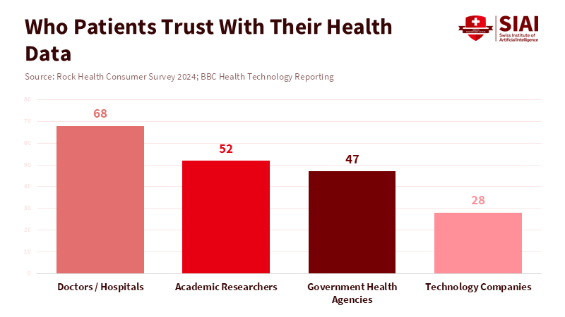
Figure 1: Patients are far more willing to share medical data with clinicians than with technology companies, even when anonymization is promised.
The reason health startups are always failing is health data monetization
Digital health is full of big ideas that often fail to deliver real value. There is a common pattern behind these failures. First, there is a payment gap: health systems and insurers, not patients, pay for care. Products based on data insights often have no clear way to get paid. Workflow is another issue. Doctors are already busy, so tools that add extra steps or alerts without making their jobs easier are quickly ignored. Regulations are also tough. Following health data rules is expensive, slow, and strict. Many startups underestimate these challenges and run out of money before they gain traction.
Health data monetization exacerbates these problems. When patients are treated as data sources, things get even more complicated. If companies do not solve the basic adoption issues, they face ethical risks and long-term responsibility. Even if businesses say they will not sell personal information, they often make money by licensing data, training models, or selling business insights to others. For patients, these differences do not matter. What matters is control. Once their data is uploaded, patients lose much of their say in how it is used.
The issue is exacerbated by the company's instability. Startups pivot. They unite. They may be bought. They don’t succeed. Data does, nevertheless, continue. When a company changes hands, data sets are also transferred under circumstances that users never foresaw. Under bankruptcy or acquisition, even solid internal protections can disintegrate. This isn't just a thought. This has happened repeatedly in the health and usage tech industries. Patients understand this risk instinctively, though legal systems may not keep pace. Because of this, a number of people choose not to take part at all.
The economic argument is weaker than it seems. While the broader data brokerage economy is large, the portion that includes high-quality, clinically helpful health data is far smaller. Buyers in this market want legal verification, provenance, and certainty. They prioritize quality over volume, and meeting these standards quickly reduces margins. As a result, health data monetization struggles to deliver venture-level returns without sacrificing standards, which further fuels public mistrust. This loop explains why so many well-funded health data projects stall or quietly vanish.
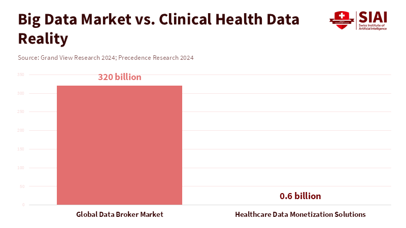
Figure 2: The headline data economy is massive, but the market for regulated, clinical-grade health data is comparatively small and slow-moving.
Steps that the policy must now take regarding health data monetization
If market incentives cannot bring together trust and value, policy should step in. Policy should encourage innovation that protects patients and delivers real public benefits. First, consent alone is not enough. Without legal guarantees, consent has limits. Patients need strong, enforceable promises that their data will be used only for agreed-upon purposes, and that these protections will endure even if organizations change. Second, transparency should be real, not just symbolic. Platforms handling medical data should publish access logs showing who accessed the data, why, and for how long. This is common in high-security fields and could become standard in health. Consent should be clear and easy to withdraw at any time. Patients should be able to grant certain uses for set periods and revoke permission later. Users should also have true control, making it easy to move or delete their data.
Public organizations additionally have a role. Health systems, universities, and regulators can create data trusts or public-interest intermediaries that manage data sets under democratic control. These groups can grant access for approved research while shielding patients from business churn. This model treats health data as a shared resource rather than as private property. It aligns incentives toward long-term value and social benefit.
Critics say that stricter rules will slow things down. That can be true in the near term. But the other possibility is worse. Scandals, negative reactions, and strict regulations that halt entire categories of innovation stem from weak governance. Durable progress in medicine has always been deliberate, gradual, and rooted in trust. Health data monetization won't be any different. The selection is between careful constraints now or recurring failure later.
Health data monetization is commonly depicted as unavoidable. It is not. It is a policy choice motivated by incentives, rules, and values. The economics of healthcare and the attitude of trust are misunderstood when medical records are treated as a revenue source. Patients are not data mines. They're partners in providing care. Most people will decide out without reliable safeguards, leaving businesses with minimal data sets and unfulfilled promises. It is obvious what to do next. Connect data use to client control. Base innovation on public interest governance. Reward systems that produce results rather than exploitation. Health data can support research and care without becoming another failed trial in digital overreach if lawmakers and organizations act now. If they do not, the industry will keep producing expensive illusions and silent collapses. The data is already showing us what works.
The views expressed in this article are those of the author(s) and do not necessarily reflect the official position of the Swiss Institute of Artificial Intelligence (SIAI) or its affiliates.
References
BBC News. (2026). OpenAI and health data integration coverage. Euronews Next. (2026). ChatGPT Health feature and medical record integration. Failory. (2025). Healthcare startup failure analysis. Grand View Research. (2024). Global data broker market report. Massively Better Healthcare. (2025). Why healthcare startups fail. Precedence Research. (2024). Healthcare data monetization solutions market. Rock Health. (2024). Consumer trust and digital health survey. Scientific American. (2026). AI, health data, and public trust.
Picture
Member for
1 year 8 months
Real name
Ethan McGowan
Bio
Professor of AI/Finance, Gordon School of Business, Swiss Institute of Artificial Intelligence
Ethan McGowan is a Professor of AI/Finance and Legal Analytics at the Gordon School of Business, SIAI. Originally from the United Kingdom, he works at the frontier of AI applications in financial regulation and institutional strategy, advising on governance and legal frameworks for next-generation investment vehicles. McGowan plays a key role in SIAI’s expansion into global finance hubs, including oversight of the institute’s initiatives in the Middle East and its emerging hedge fund operations.
Tariffs may work for semiconductors, but they fail as a broad industrial policy
Volatile tariff revenue signals deeper economic and institutional costs
Punishment-based trade erodes trust that long-term investment needs
China’s free-trade rhetoric at APEC clashes with its ongoing industrial subsidies
Without subsidy discipline, regional trust and fair competition cannot recover
APEC’s credibility depends on rules, not gestures