SIAI Chart
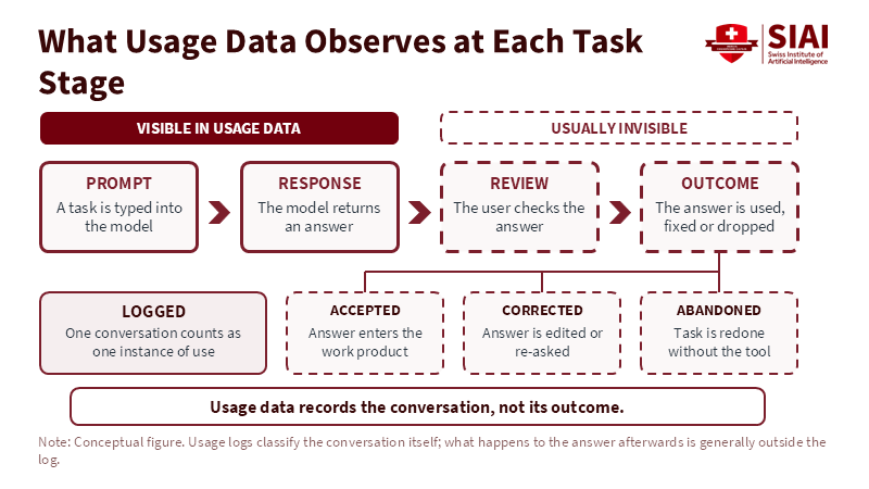
Figure 2: Logs capture the prompt and response, while acceptance, correction and abandonment happen out of view. Related article:
Read More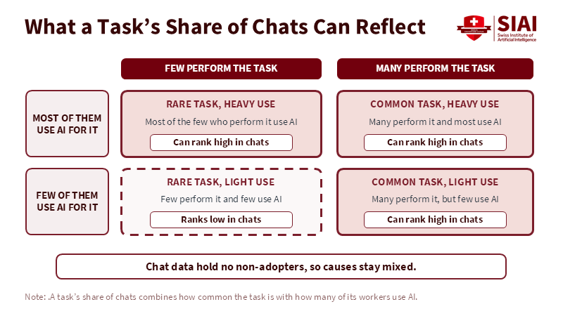
SIAI Chart
Figure 1: A high chat share can come from a common task, heavy use, or both, and chat data cannot say which. Related article:
Read More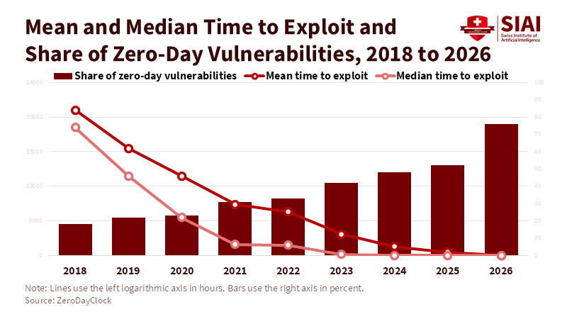
SIAI Chart
Figure 1: Mean time to exploit dropped below ten hours in 2026 as the share of zero-day vulnerabilities reached about three-quarters. Related article:
Read More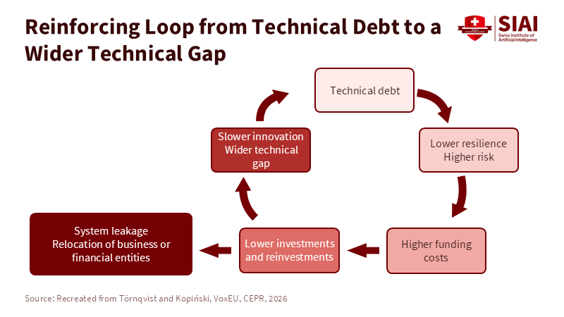
SIAI Chart
Figure 2: Each round of weaker defence raises funding costs and cuts reinvestment, which widens the gap that started the loop. Related article:
Read More