AI Memo
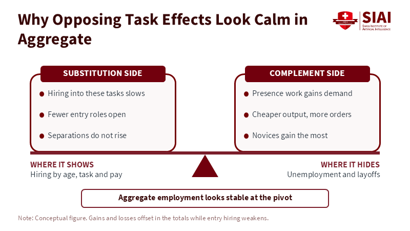
Figure 2: Losses and gains balance in the totals, so the change shows up in who gets hired, not in the unemployment rate. Related article:
Read More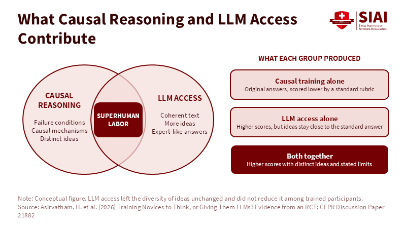
Figure 1: Each input supplies what the other lacks; only the overlap delivers both scores and originality. Related article:
Read More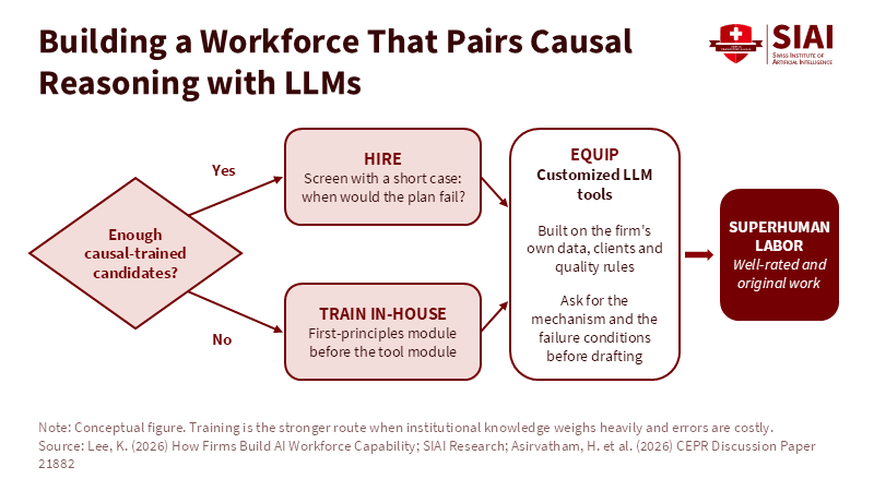
Figure 2: Hiring and in-house training feed the same customized tool layer. Related article: Superhuman Labor: Hiring, Tr
Read More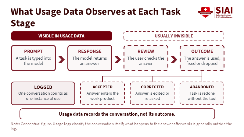
Figure 2: Logs capture the prompt and response, while acceptance, correction and abandonment happen out of view. Related article:
Read More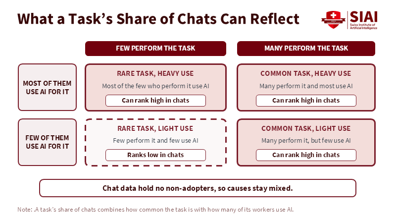
Figure 1: A high chat share can come from a common task, heavy use, or both, and chat data cannot say which. Related article:
Read More







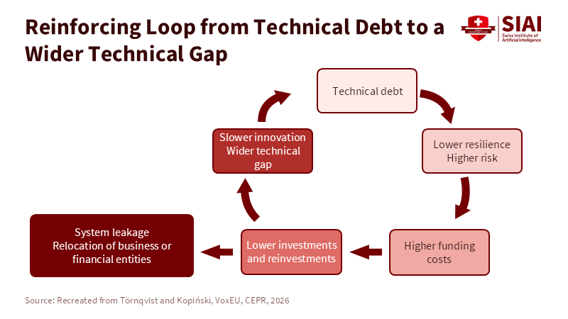
Figure 2: Each round of weaker defence raises funding costs and cuts reinvestment, which widens the gap that started the loop. Related article:
Read More