AI Labor Cost Is the New Productivity Shock in Education
Picture
Member for
1 year 9 months
Real name
Keith Lee
Bio
Keith Lee is Professor of AI and Finance at the Gordon School of Business, Swiss Institute of Artificial Intelligence (SIAI). His primary research lies in financial mathematics and AI-driven computational science, with a focus on quantitative modeling of complex economic and financial systems. His work integrates machine learning, stochastic modeling, and data-centric methods to study structural transformations in markets and institutions.
In recent years, his research has extended to the economic and fiscal implications of technological change, including the interaction between artificial intelligence, demographic shifts, and public finance sustainability.
He holds a PhD in Mathematical Finance from Boston University, and previously earned an MSc in Finance and Economics from the London School of Economics. He completed his undergraduate studies in Economics at Seoul National University under the Korea Foundation for Advanced Studies scholarship program.
He regularly contributes analytical essays on the broader socioeconomic implications of AI to The Economy Review.
Published
Modified
AI labor cost has collapsed, making routine knowledge work pennies
Schools should meter tokens, track accepted outputs, and redirect savings to student time
Contract for pass-through price drops and keep human judgment tasks off-limits
The price of machine work has dropped faster than most education leaders understand. In 2024, many firms paid around $10 per million tokens to automate text tasks using AI. By March 2025, typical rates of about $2.50 were standard, marking a 75% decrease. On some major platforms, the price is now as low as $0.10 per million input tokens and $0.40 per million output tokens. This enables a variety of routine writing, summarizing, and coding tasks to be completed for just a few cents each at scale. This is not about impressive demonstrations; it’s about costs. When a fundamental input for white-collar work becomes so inexpensive, it acts like a sudden wage cut for specific tasks across the economy. This sudden and significant decrease in the cost of AI labor is what we refer to as the 'AI labor cost shock'. For education systems that heavily invest in knowledge work—such as curriculum development, administrative services, IT support, and student services—the budget is affected first, well before teaching methods catch up.
AI labor cost is the productivity shock we’re overlooking
Macroeconomists have observed that AI innovation operates as a supply push, increasing output and lowering prices as total productivity improves over several years. This macro view is essential for schools, colleges, and education vendors because it shows the connection: productivity gains involve not just more innovative tools but also cheaper task hours. The AI labor cost channel, a term we use to describe the direct impact of AI on reducing costs for routine, text-based tasks, such as drafting policies, answering tickets, cleaning data, writing job postings, or generating preliminary code, is a key aspect to understand. Recent studies demonstrate the impact of applying these tools in real-world work settings. In customer support, a generative AI assistant improved the number of issues resolved per hour by about 15% on average, with gains exceeding 30% for less-experienced staff. In controlled writing assignments, time decreased by approximately 40% while quality improved. These findings aren’t isolated cases; they prove that specific, clearly defined tasks are already experiencing lower costs comparable to wages.
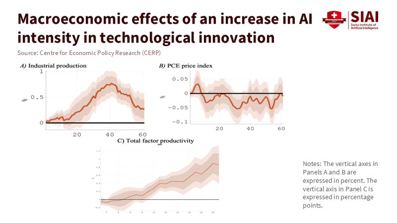
Figure 1: AI innovation behaves like a positive supply shock: industrial output and TFP rise over several years while price pressure eases, consistent with falling unit task costs.
Examining costs also informs the discussion of equity. Labor is the primary input for knowledge production. In sectors that rely heavily on research and development, over two-thirds of expenses are allocated to labor compensation; in the broader U.S. nonfarm business sector, labor’s share of income remained close to its long-term average through mid-2025. If AI labor costs rapidly decline for our most common tasks—editing, synthesizing, answering questions, coding—the basic expectation is that early adopters will see profit margins expand, followed by price pressure as competitors catch up. Educational institutions serve as both buyers and producers, purchasing services and creating curricula, assessments, and large-scale student support. Being mindful of costs is essential; it determines whether AI helps expand quality and access or whether savings are lost through widespread discounts.
AI labor cost in classrooms, back offices, and budgets
The first benefits show up where outputs can be standardized and reviewed. Support chats for students, financial aid Q&A, updates to IT knowledge bases, drafting syllabus templates, creating boilerplate for grants, and generating initial code for data dashboards all fit this mold. Here, the AI labor cost story is straightforward: pay per token, track usage, and measure costs per accepted output. Public pricing makes budgeting manageable. One major vendor currently lists $0.15 per million input tokens in a low-cost tier; another offers $0.10 per million input tokens in an even cheaper tier. With the use of prompt libraries and caching, marginal costs can be further reduced. A practical note: track three metrics for each case—tokens for accepted outputs, acceptance rates after human review, and staff time saved compared to the baseline. The policy shift should move from “hours budgeted” to “accepted outputs per euro,” allowing humans to focus on exceptions and judgments.
However, not every human hour can be easily replaced. New evidence from Carnegie Mellon in 2025 highlights the limitations of replacing humans with language models in qualitative research roles. When researchers attempted to use models as study participants, the results lacked clarity, omitted context, and raised concerns about consent. In software engineering, research has also shown that models can mimic human reviewers on specific coding tasks, but only in tightly controlled situations with clear guidelines. The lesson for education is clear: AI labor cost can take over routine, defined tasks that fit templates, but it should not replace student voices, personal experiences, or ethical inquiry. Procurement policies must establish clear boundaries to protect tasks that involve human judgment, emphasizing the value and integral role of human judgment tasks in the process.
Budgets should also account for price fluctuations. A price war is on the horizon: one major competitor cut off-peak API rates by up to 75% in 2025, prompting established companies to respond with cheaper “flash” or “mini” tiers and larger context windows. Yet costs don’t only decrease. As workflows become more automated, usage can increase significantly, and heavy users may exceed their flat-rate plans. For universities testing automated coding teachers or bulk document processing, this means two controls are crucial: caps on usage at the account level and policies for managing workflows effectively when those caps are reached. Treat AI labor costs as a market rate that could rise or fall based on features, rather than a permanent discount. This strategic approach to managing AI labor costs enables you to maintain control over your budget and operations, ensuring a more effective and efficient use of resources.
AI labor cost, prices, and what’s next
If education vendors experience significant increases in profit margins, will prices for services drop? Macro evidence indicates that AI innovation leads to decreases in consumer prices over time as productivity increases take effect. However, the timing hinges on market structure. In competitive areas, such as content localization, transcription, and large-scale assessments, price cuts are likely to occur sooner. In concentrated markets, savings may be redirected to product development before they reach buyers. For public systems, a more effective approach is to include AI labor cost metrics in contracts that specify prices for accepted items, allowed model types, cache hit ratios, and clauses to adjust for decreases in token prices. This turns unpredictable tech changes into manageable economic factors, offering a hopeful outlook for the future.
Finally, let’s consider the workforce. Most productivity gains so far have benefited less-experienced workers who adopt AI tools, consistent with a catch-up narrative. This supports a training strategy that targets the first two years on the job, focusing on training in prompt patterns, review checklists, and judgment exercises that enhance tool output to meet institutional standards. However, the risks associated with exposure are uneven. Analyses from the OECD and the ILO indicate that lower-education jobs and administrative roles, which women disproportionately hold, are at a higher risk of automation. Responsible adoption means redeploying staff instead of discarding them: retaining human-centered work where empathy, discretion, and context are essential, and supporting these positions with savings from tasks that AI can automate.
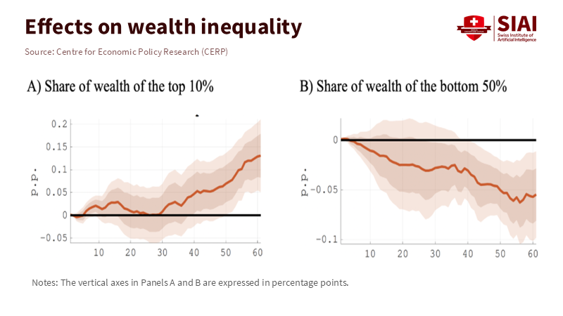
Figure 2: Without policy, AI gains skew wealth upward—top 10% share rises as the bottom 50% slips—so contracts should pass savings through to wages, training, and student services.
Toward a practical cost strategy
The shift in perspective is clear: stop questioning whether AI is “good for education” in general and start examining where AI labor cost can enhance access and quality for every euro spent. Begin with three immediate actions. First, redesign workflows so that models handle the routine tasks while people provide oversight. Use the evidence from writing and support as a benchmark. If a pilot isn’t demonstrating double-digit time savings or quality improvements upon review, adjust the workflow or terminate the pilot. Create dashboards that track accepted outputs per 1,000 tokens and the time saved through human review for each unit. Always compare these numbers to a consistent pre-AI baseline to avoid shifting targets.
Second, approach purchases like a CFO rather than a lab. Set maximum limits on monthly tokens, require vendors to disclose which model families and pricing tiers they offer, and automatically review prices when public rates drop by a specified amount. This makes enforcing contracts easier. Combine prompt caching with lower-tier models for drafts and higher-tier reviews for final outputs; this blended AI labor cost will outperform single-tier spending while maintaining quality. Include limits for any workflow that begins to make too many calls and risks exceeding budget limits.
Third, draw clear lines on tasks that cannot be replaced. The findings from Carnegie Mellon serve as a cautionary example: using language models in place of human participants muddies what we value. In schools, this applies to counseling, providing qualitative feedback on assignments connected to identity, and engaging with the community. Keep these human. Assign AI to logistics, drafts, and data preparation. In software education, models can act as code reviewers under established guidelines. However, students still need to articulate their intent and rationale verbally. The guiding principle should be that when the task requires judgment, AI labor cost should not dictate your purchasing decisions.
These decisions are made within a broader macro context. As AI innovation increases productivity and lowers prices, specific sectors are expected to witness higher wages and increased hiring. In contrast, others will experience higher turnover rates. For public education systems, this is a design decision. Use contracts and budgets to prioritize savings for teaching time, tutoring services, and student support. Allocate funds for small-group instruction by utilizing the hours saved from paperwork handled by AI. Invest in staff training so that the most significant gains—those benefiting new workers who access practical tools—also support early-career teachers and advisors rather than just central offices.
A budget is a moral document. Use the savings for students
We return to the initial insight. Prices for machine text work have plummeted at key tiers, and the typical effort required for white-collar tasks—like editing, summarizing, or drafting—now costs mere pennies at scale. This is the AI labor cost shock. Macro data indicate that productivity improvements can lead to increased output and lower prices over time; micro studies reveal that targeted task substitutions already save time and enhance quality; ethical research notes that substitutions have firm limits where human voices and consent are concerned. Taken together, the policy is clear. Treat AI as a measured labor input. Track accepted outputs instead of hype. Include clauses to capture price declines in contracts. Safeguard tasks that require judgment. And focus the saved resources where they matter most: human attention on learning. If done correctly, education can transform a groundbreaking technology into a quiet revolution in costs, access, and quality—one accepted output at a time.
The views expressed in this article are those of the author(s) and do not necessarily reflect the official position of the Swiss Institute of Artificial Intelligence (SIAI) or its affiliates.
References
Acemoglu, D. (2024). The Simple Macroeconomics of AI. NBER Working Paper 32487. Anthropic. (2025a). Pricing. Anthropic. (2025b). Web search on the Anthropic API. Business Insider. (2025, Aug.). ‘Inference whales’ are eating into AI coding startups’ business model. (accessed 1 Oct 2025). Carnegie Mellon University, School of Computer Science. (2025, May 6). Can Generative AI Replace Humans in Qualitative Research Studies? News release. Federal Reserve Bank of St. Louis (FRED). (2025). Nonfarm Business Sector: Labor Share for All Workers (Index 2017=100). (updated Sept. 4, 2025). Gazzani, A., & Natoli, F. (2024, Oct. 18). The macroeconomic effects of AI innovation. VoxEU (CEPR). Google. (2025). Gemini 2.5 pricing overview. International Labour Organization. (2025, May 20). Generative AI and Jobs: A Refined Global Index of Occupational Exposure. (accessed 1 Oct 2025). Noy, S., & Zhang, W. (2023). Experimental evidence on the productivity effects of generative artificial intelligence. Science, 381(6654). OpenAI. (2025a). Platform pricing. OpenAI. (2025b). API pricing (fine-tuning and scale tier details). (accessed 1 Oct 2025). Ramp. (2025, Apr. 15). AI is getting cheaper. Velocity blog. (accessed 1 Oct 2025). Reuters. (2025, Feb. 26). DeepSeek cuts off-peak pricing for developers by up to 75%. (accessed 1 Oct 2025). U.S. Bureau of Labor Statistics. (2025, Mar. 21). Total factor productivity increased 1.3% in 2024. Productivity program highlights. (accessed 1 Oct 2025). Wang, R., Guo, J., Gao, C., Fan, G., Chong, C. Y., & Xia, X. (2025). Can LLMs Replace Human Evaluators? An Empirical Study of LLM-as-a-Judge in Software Engineering. arXiv:2502.06193.
Picture
Member for
1 year 9 months
Real name
Keith Lee
Bio
Keith Lee is Professor of AI and Finance at the Gordon School of Business, Swiss Institute of Artificial Intelligence (SIAI). His primary research lies in financial mathematics and AI-driven computational science, with a focus on quantitative modeling of complex economic and financial systems. His work integrates machine learning, stochastic modeling, and data-centric methods to study structural transformations in markets and institutions.
In recent years, his research has extended to the economic and fiscal implications of technological change, including the interaction between artificial intelligence, demographic shifts, and public finance sustainability.
He holds a PhD in Mathematical Finance from Boston University, and previously earned an MSc in Finance and Economics from the London School of Economics. He completed his undergraduate studies in Economics at Seoul National University under the Korea Foundation for Advanced Studies scholarship program.
He regularly contributes analytical essays on the broader socioeconomic implications of AI to The Economy Review.
AI Productivity in Education: Real Gains, Costs, and What to Do Next
Picture
Member for
1 year 9 months
Real name
Keith Lee
Bio
Keith Lee is Professor of AI and Finance at the Gordon School of Business, Swiss Institute of Artificial Intelligence (SIAI). His primary research lies in financial mathematics and AI-driven computational science, with a focus on quantitative modeling of complex economic and financial systems. His work integrates machine learning, stochastic modeling, and data-centric methods to study structural transformations in markets and institutions.
In recent years, his research has extended to the economic and fiscal implications of technological change, including the interaction between artificial intelligence, demographic shifts, and public finance sustainability.
He holds a PhD in Mathematical Finance from Boston University, and previously earned an MSc in Finance and Economics from the London School of Economics. He completed his undergraduate studies in Economics at Seoul National University under the Korea Foundation for Advanced Studies scholarship program.
He regularly contributes analytical essays on the broader socioeconomic implications of AI to The Economy Review.
Published
Modified
AI productivity in education is real but uneven and adoption is shallow
Novices gain most; net gains require workflow redesign, training, and guardrails
Measure time returned and learning outcomes—not hype—and scale targeted pilots
The most relevant number we have right now is small but significant. In late 2024 surveys, U.S. workers who used generative AI saved about 5.4% of their weekly hours. Researchers estimate this translates to approximately a 1.1% increase in productivity across the entire workforce. This is not a breakthrough, but it is also not insignificant. For a teacher or instructional designer working a 40-hour week, this saving amounts to just over two hours weekly, assuming similar patterns continue. The key question for AI productivity in education is not whether the tools can create rubrics or outline lessons, as they can. Instead, it's whether institutions will change their processes so those regained hours lead to better feedback, stronger curricula, and fairer outcomes, without introducing new risks that offset the gains. The answer depends on where we look, how we measure, and what we decide to focus on first.
AI productivity in education is inconsistent and not straightforward
Most headlines suggest that advancements benefit everyone. Early evidence, however, points to a bumpier road. In a randomized rollout at an extensive customer support operation, access to a generative AI assistant increased agent productivity by approximately 14% to 15% on average, with the most significant improvements observed among less-experienced workers. This pattern is essential for AI productivity in education. When novice teachers, new TAs, or early-career instructional staff have structured AI support, their performance aligns more closely with that of experienced educators, offering a beacon of hope in the journey of AI integration in education. But in areas outside the model's strengths—tasks that require judgment, unique contexts, and local nuances—AI can mislead or even hinder performance. Field experiments with consultants show the same inconsistent results: strong improvements on well-defined tasks, and weaker or adverse effects on more complex problems. The takeaway is clear. We will see significant wins in specific workflows, not universally, and the most considerable initial benefits will be realized by "upper-junior" staff and students who need the most support.
The extent of adoption is another barrier. U.S. survey data indicate that generative AI is spreading quickly overall. Still, only a portion of workers use it regularly for their jobs. One national study found that 23% of employed adults used it for work at least once in the previous week. OpenAI's analysis suggests that about 30% of all ChatGPT usage is work-related, with the remainder being personal. In educational settings, this divide is evident as faculty and students test tools for minor tasks. At the same time, core course design and assessment remain unchanged. If only a minority use AI at work and even fewer engage deeply, system-wide productivity barely shifts. This isn't a failure of the technology; it signals that policy should focus on encouraging deeper use in the workflows that matter most for learning and development.
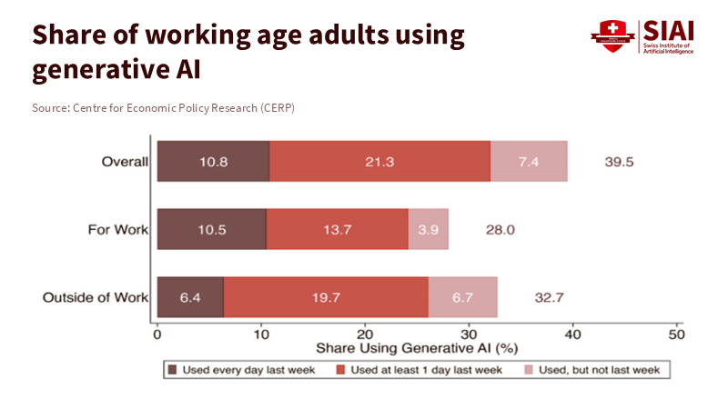
Figure 1: Adoption is broad but shallow: only 28% used generative AI for work last week, and daily work users are just 10.5%—depth, not headlines, will move campus productivity.
Improving AI productivity in education needs more than tools
The basic technology is advancing rapidly, but AI productivity in education relies on several key factors: high-quality data, redesigned workflows, practical training, and robust safeguards. The Conversation's review of public-sector implementations is clear: productivity gains exist, but they require significant effort and resources to achieve. Integration costs, oversight, security, and managing change consume time and funds. These aren't extras; they determine whether saved minutes translate into better teaching or are lost to additional work. In software development, controlled studies have shown significant time savings—developers complete tasks approximately 55% faster with AI pair programmers when tasks are well-defined and structured. However, organizations only realize these gains when they standardize processes, document prompts, and improve code review. Education is no different. To turn drafts into tangible outcomes, institutions need shared templates, model "playbooks," and clear guidelines for uncertain situations, providing reassurance and guidance throughout the AI integration process.
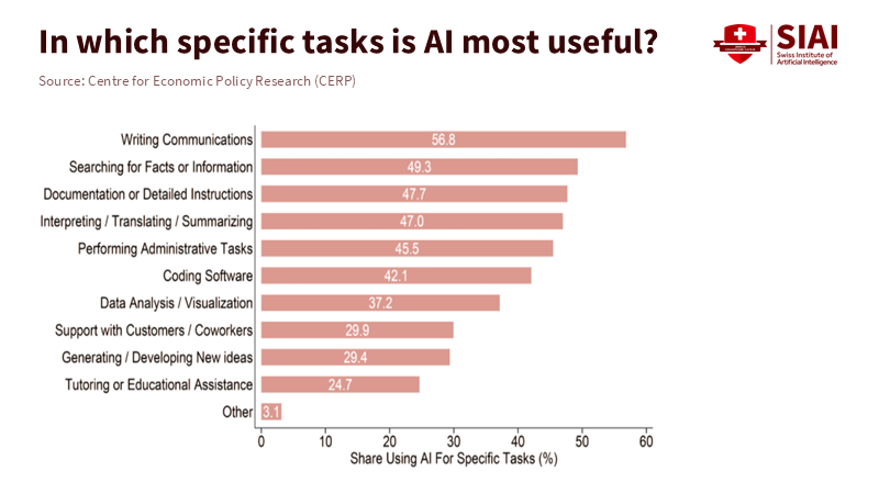
Figure 2: The gains cluster in routinized tasks—writing, search, documentation—pointing schools to target formative feedback, item banks, and admin triage where AI complements judgment.
Costs and risk management also influence the rate of adoption. Hallucinations can be reduced with careful retrieval and structured prompts, but they won't disappear completely. Privacy regulations limit what student data can be processed by a model. Aligning curricula takes time and careful design. These challenges help explain why national productivity hasn't surged despite noticeable AI adoption. In the U.S., labor productivity grew about 2.3% in 2024 and 1.5% year-over-year by Q2 2025—an encouraging uptick after a downturn, but far from a substantial AI-driven change. This isn't a judgment on the future of education with AI; it reflects the context. The macro trend is improving, but significant gains will come from targeted, well-managed deployments in key educational processes, rather than blanket approaches.
Assess AI productivity in education by meaningful outcomes, not hype.
We should rethink the main question. Instead of asking, "Has productivity really increased?", we should ask, "Where, for whom, and at what total cost?" For AI productivity in education, three outcome areas matter most. First, time is saved on low-stakes tasks that can be redirected toward feedback and student interaction. Second, measurable improvements in assessment quality and course completion rates for at-risk learners. Third, institutional resilience: fewer bottlenecks in student services, less variability across sections, and shorter times from evidence to course updates. The best evidence we have suggests that when AI assists novices, the performance gap decreases. This presents a policy opportunity: target AI at bottlenecks for early-career instructors and first-generation students, and design interventions that allow the "easy" time savings to offset the "hard" redesign work that follows.
Forecasts should be approached cautiously. The Penn Wharton Budget Model predicts modest, non-linear gains from generative AI for the broader economy, with more potent effects expected in the early 2030s before diminishing as structures adapt. Applied to campuses, the lesson is clear. Early adopters who redesign workflows will capture significant benefits first; those who lag will experience smaller, delayed returns and may end up paying more for retrofits. That's why it's essential to measure outcomes: hours returned to instruction, reductions in grading variability, faster support for students who fall behind, and documented error rates in AI-assisted outputs. If we can't track these, we're not managing productivity; we're just guessing. This emphasis on measuring outcomes instills a sense of responsibility and accountability in the audience, encouraging them to participate actively in the AI integration process.
A practical agenda for the next 18 months
The way forward begins with focus. Identify three workflows where AI productivity in education can increase both time and quality: formative feedback on drafts, generating aligned practice items with explanations, and triaging student services. In each, establish what the "gold standard" looks like without AI, then insert the model where it can replace repetitive tasks and support decision-making, not replace it altogether. Use specific retrieval for course-related content to minimize hallucinations. Establish a firm guideline: anything high-stakes—such as final grades or progression decisions—requires human review. Document this and provide training. Show the first improvements in returned time to instructors and faster responses for students. Evidence, not excitement, should guide the next wave of AI use.
Procurement should reward complementary tools. Licenses must include organized training, prompt libraries linked to the learning management system, and APIs for safe retrieval from approved course repositories. Create incentives for teams to share their workflows—how they prompt, review, and what they reject—so that knowledge builds across departments. Start with small, cross-functional pilot projects: a program lead, a data steward, two instructors, a student representative, and an IT partner. Treat each pilot as a mini-randomized controlled trial: define the target metric, gather a baseline, run it for a term, and publish a brief report on methods. This is how AI productivity in education transforms from a vague promise into a manageable, repeatable process.
Measurement must accurately reflect costs—track computing and licensing expenses, as well as the "hidden" labor involved in redesigning and reviewing. If a course saves ten instructor hours per week on drafting but adds six hours for quality control because prompts deviate, the net gain is four hours. That is still a win, but smaller, and it points to the following fix: stabilize prompts, use drafts to teach students to critique AI outputs, and automate permitted checks. Where effect sizes are uncertain, borrow from labor-market studies by measuring not only the outputs created but also the hours saved and reductions in variability. Suppose novices close the gap with experts in rubric-based grading or writing accuracy. In that case, the benefits will be seen in more consistent learning experiences and higher progression rates for historically struggling students.
Finally, maintain control of the narrative while grounding it in reality. Macro numbers will fluctuate—quarterly productivity does this—and bold claims will continue to emerge. Maintain a close connection between campus evidence and policy if pilot projects show a steady two-hour weekly return per instructor without a decline in quality, scale that up. If error rates increase in certain classes, pause to address retrieval or assessment design issues before expanding the scope of the intervention. Use clear method notes in your reports. If adoption lags, don't blame reluctance; instead, look for gaps in workflows and training. The economies that benefit most from AI are not the loudest; they are the ones that effectively pair technology with process and people, all while learning in public. This is how AI productivity in education becomes a reality and a lasting impact.
We started with a modest figure: a 1.1% productivity boost at the workforce level, driven by a 5.4% time savings among users. Detractors might view this as lackluster. However, in education, it is enough to alter the baseline if we consider it working capital—time we reinvest into providing feedback, improving course clarity, and enhancing student support. The evidence shows us where the gains begin: at the "upper-junior" level, in routine tasks that free up expert time, and in redesigns that establish strong practices as standard. The risks are real, and the costs are not trivial. But we can set the curve. If we align incentives to deepen use in a few impactful workflows, purchase complementary tools instead of just licenses, and measure what students and instructors truly gain, the small increases will add up. That is the vital productivity story of the day. It's not about a headline figure. It's about the week-by-week time returned to the work that only educators can do.
The views expressed in this article are those of the author(s) and do not necessarily reflect the official position of the Swiss Institute of Artificial Intelligence (SIAI) or its affiliates.
References
Bick, A., Blandin, A., & Mertens, K. (2024). The Rapid Adoption of Generative AI. NBER Working Paper w32966 / PDF. (Adoption levels; work-use share.) Bureau of Labor Statistics. (2025). Productivity and Costs, Second Quarter 2025, Revised; and related Productivity home pages. (U.S. productivity growth, 2024–2025.) Brynjolfsson, E., Li, D., & Raymond, L. (2025). Generative AI at Work. Quarterly Journal of Economics 140(2), 889–944; and prior working papers. (14–15% productivity gains; largest effects for less-experienced workers.) Dell’Acqua, F., McFowland III, E., Mollick, E. R., et al. (2023). Navigating the Jagged Technological Frontier: Field Experimental Evidence of the Effects of AI on Knowledge Worker Productivity and Quality. HBS Working Paper; PDF. (Heterogeneous effects; frontier concept.) Noy, S., & Zhang, W. (2023). Experimental Evidence on the Productivity Effects of Generative Artificial Intelligence. Science (2023) and working paper versions. (Writing task productivity, quality effects.) OpenAI. (2025). How people are using ChatGPT. (Share of work-related usage ~30%.) Penn Wharton Budget Model. (2025). The Projected Impact of Generative AI on Future Productivity Growth. (Modest, non-linear macro effects over time.) St. Louis Fed. (2025). The Impact of Generative AI on Work Productivity. (Users save 5.4% of hours; ~1.1% workforce productivity.) The Conversation / University of Melbourne ADM+S. (2025). Does AI really boost productivity at work? Research shows gains don’t come cheap or easy. (Integration costs, governance, and risk.) GitHub / Research. (2023–2024). The Impact of AI on Developer Productivity. (Task completion speedups around 55% in bounded tasks.)
Picture
Member for
1 year 9 months
Real name
Keith Lee
Bio
Keith Lee is Professor of AI and Finance at the Gordon School of Business, Swiss Institute of Artificial Intelligence (SIAI). His primary research lies in financial mathematics and AI-driven computational science, with a focus on quantitative modeling of complex economic and financial systems. His work integrates machine learning, stochastic modeling, and data-centric methods to study structural transformations in markets and institutions.
In recent years, his research has extended to the economic and fiscal implications of technological change, including the interaction between artificial intelligence, demographic shifts, and public finance sustainability.
He holds a PhD in Mathematical Finance from Boston University, and previously earned an MSc in Finance and Economics from the London School of Economics. He completed his undergraduate studies in Economics at Seoul National University under the Korea Foundation for Advanced Studies scholarship program.
He regularly contributes analytical essays on the broader socioeconomic implications of AI to The Economy Review.
India can secure cheap, reliable evening power at $0.042/kWh with solar plus storage
Tariffs and volatile fossil imports make firm renewables the safest growth path
Scaling batteries and recycling ensures long-term energy security and stable prices
European economics journals reform must reward method and openness over brand prestige
Tie hiring and grants to reproducibility—open code, preregistration, independent replications
Build EU benchmarks and nimble society journals so reliable work earns global reach
Retail investing is up; teach people to earn the market, not chase alpha.
Use low fees, diversification, and cool-off safeguards to curb herding and fraud—especially for seniors
Tie curricula to app defaults so good habits are automatic and long-term wealth compounds
Education and the AI Bubble: Talk Isn't Transformation
Picture
Member for
1 year 9 months
Real name
Keith Lee
Bio
Keith Lee is Professor of AI and Finance at the Gordon School of Business, Swiss Institute of Artificial Intelligence (SIAI). His primary research lies in financial mathematics and AI-driven computational science, with a focus on quantitative modeling of complex economic and financial systems. His work integrates machine learning, stochastic modeling, and data-centric methods to study structural transformations in markets and institutions.
In recent years, his research has extended to the economic and fiscal implications of technological change, including the interaction between artificial intelligence, demographic shifts, and public finance sustainability.
He holds a PhD in Mathematical Finance from Boston University, and previously earned an MSc in Finance and Economics from the London School of Economics. He completed his undergraduate studies in Economics at Seoul National University under the Korea Foundation for Advanced Studies scholarship program.
He regularly contributes analytical essays on the broader socioeconomic implications of AI to The Economy Review.
Published
Modified
The AI bubble rewards talk more than results
Schools should pilot, verify, and buy only proven gains using LRAS and total-cost checks
Train teachers, price energy and privacy, and pay only for results that replicate
A single number should make us pause: 287. That's how many S&P 500 earnings calls in one quarter mentioned AI, the highest in a decade and more than double the five-year average. However, analysts note that for most companies, profits directly linked to AI are rare. This situation highlights a classic sign of an AI bubble. Education is proper in the middle of it. Districts are getting pitches that reflect market excitement. If stock prices can rise based on just words, so can school budgets. We cannot let talk replace real change. The AI bubble must not become our spending plan. The first rule is simple: talk does not equal transformation; improved learning outcomes do. The second is urgent: establish strict criteria before making large expenditures. If we make a mistake, we risk sacrificing valuable resources for headlines and later face parents with explanations for why the results never materialized. The AI bubble is real, and schools must avoid inflating it. Setting high standards for AI adoption is crucial, and it's our commitment to excellence and quality that will guide us in this journey.
The AI bubble intersects with the classroom
We need to rethink the discussion around incentives—markets reward mentions of AI. Schools might imitate this behavior, focusing on flashy announcements instead of steady progress. It's easy to find evidence of hype. FactSet shows a record number of AI references on earnings calls. The Financial Times and other sources report that many firms still struggle to clearly articulate the benefits in their filings, despite rising capital spending. At the same time, the demand for power in AI data centers is expected to more than double by 2030, with the IEA estimating global data-center electricity use to approach 945 TWh by the end of the decade. These are the real costs of pursuing uncertain benefits. When budgets tighten, education is often the first to cut long-term investments, such as teacher development and student support, in favor of short-term solutions. That is the bubble's logic. It rewards talk while postponing proof.
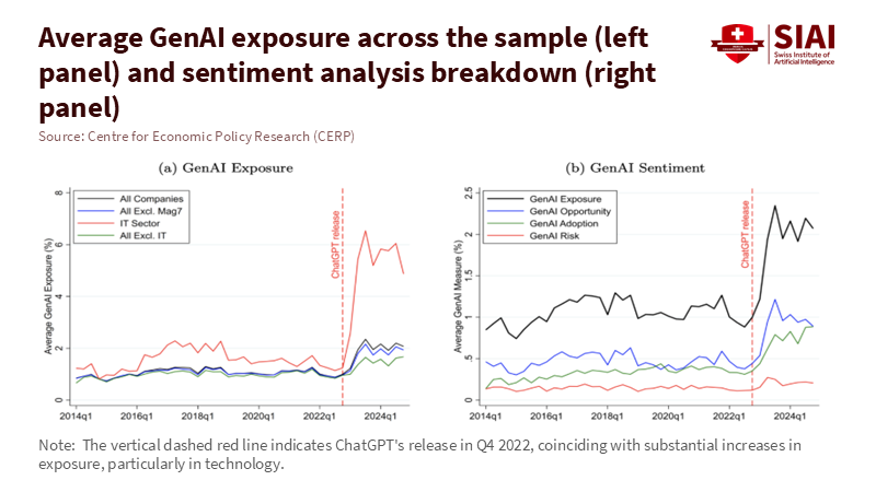
Figure 1: Post-ChatGPT, AI exposure and upbeat sentiment spike—especially in IT—while “risk” barely moves. Talk outruns evidence.
But schools are not standing still. In the United States, the number of districts training teachers to use AI nearly doubled in a year, from 23% to 48%. However, the use among teachers is still uneven. Only about one in four teachers reported using AI tools for planning or instruction in the 2023-24 school year. In the UK, the Department for Education acknowledges the potential of AI but warns that evidence is still developing. Adoption must ensure safety, reliability, and teacher support. UNESCO's global guidance offers a broader perspective: proceed cautiously, involve human judgment, protect privacy, and demand proof of effectiveness. This approach is appropriate for a bubble. Strengthen teacher capacity and establish clear boundaries before scaling up purchases. Do not let vendor presentations replace classroom trials. Do not invest in "AI alignment" if it doesn't align with your curriculum. Thorough evaluation is key before scaling up AI investments, and it's our responsibility to ensure it's done diligently.
The macro signals send mixed messages. On the one hand, investors are pouring money into infrastructure, while the press speculates about a potential AI bubble bursting. On the other hand, careful studies report productivity gains under the right conditions. A significant field experiment involving 758 BCG consultants found that access to GPT-4 improved output and quality for tasks within the model's capabilities, but performance declined on tasks beyond its capabilities. MIT and other teams report faster, better writing on mid-level tasks; GitHub states that completion times with Copilot are 55% faster in controlled tests. Education must navigate both truths. Gains are real when tasks fit the tool and the training is robust. Serious risks arise if errors go unchecked or when the task is inappropriate. The bubble grows when we generalize from narrow successes to broad changes without verifying whether the tasks align with schoolwork.
From hype to hard metrics: measuring the AI bubble's learning ROI
The main policy mistake is treating AI like a trend rather than a learning tool. We should approach it in the same way we do any educational resource. First, define the learning return on AI investment (LRAS) as the expected learning gains or verified teacher hours saved per euro, minus the costs of training and integration. Keep it straightforward. Imagine a district is considering a €30 monthly license per teacher. If the tool reliably saves three teacher hours each week and the loaded hourly cost is €25, the time savings alone amount to €300 per teacher per term. This looks promising—if it's validated within your context, rather than based on vendor case studies. Measurement method: track time saved with basic time-motion logs and random spot checks; compare with student outcomes where relevant; adjust self-reports by 25% to account for optimism bias.
This approach also applies to student learning. A growing body of literature suggests that well-structured AI tutors can enhance outcomes. Brookings highlights randomized studies showing that AI support led to doubled learning gains compared to strong classroom models; other trials indicate that large language model assistants help novice tutors provide better math instruction. However, the landscape is uneven. The BCG field experiment cautions that performance declines when tasks exceed the model's strengths. In a school context, utilize AI for drafting rubrics, generating diverse practice problems, and identifying misunderstandings; however, verify every aspect related to grading and core content. Require specific outcome measures for pilot programs—such as effect sizes on unit tests or reductions in regrade requests—and only scale up if the improvements are consistent across schools.
Now consider the system costs. Data centers consume power; power costs money. The IEA forecasts that global data-center electricity use could more than double by 2030, with AI driving much of this growth. Local impacts are significant. Suppose your region faces energy limitations or rising costs. In that case, AI services might come with hidden "energy taxes" reflected in subscription fees. The Uptime Institute reports that operators are already encountering power limitations and rising costs due to the demand for AI. A district that commits to multi-year contracts during an excitement phase could lock in higher prices just as the market settles.
Finally, compare market signals with what's happening on the ground. FactSet indicates a record-high number of AI mentions; Goldman Sachs notes a limited direct profit impact so far; The Guardian raises questions about the dynamics of the bubble. In education, HolonIQ is tracking a decline in ed-tech venture funding in 2024, the lowest since 2014, despite an increase in AI discussions. This disparity illustrates a clear point. Talk is inexpensive; solid evidence is costly. If investment follows the loudest trends while schools chase the noisiest demos, we deepen the mistake. A better approach is to conduct narrow pilots, evaluate quickly, and scale carefully.
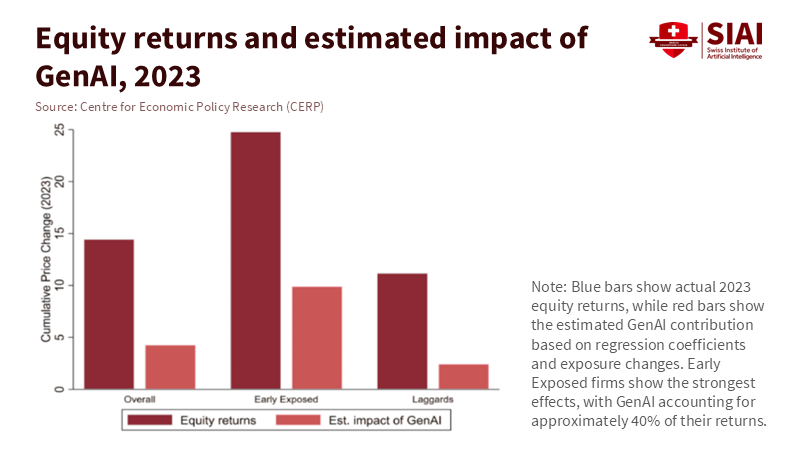
Figure 2: 2023 gains concentrate in early-exposed firms; GenAI explains ~40% of their returns—narrow breadth beneath the hype.
A better approach than riding the AI bubble
Prioritize outcomes in procurement. Use request-for-proposal templates that require vendors to clearly define the outcome they aim to achieve, specify the unit of measurement they will use, and outline the timeline they will follow. Implement a step-by-step rollout across schools: some classrooms utilize the tool while others serve as controls, then rotate. Keep the test short, transparent, and equitable. Insist that vendors provide raw, verifiable data and accept external evaluations. Consider dashboards as evidence only if they align with independently verified metrics. This is not red tape; it's protection against hype. UK policy experiments are shifting towards this approach, emphasizing a stronger evidence base and guidelines that prioritize safety and reliability. UNESCO's guidance is explicit: human-centered, rights-based, evidence-driven. Include that in every contract.
Prepare teachers before expanding tool usage. RAND surveys indicate forward movement alongside gaps. Districts have doubled their training rates year over year, but teacher use remains uneven, and many schools lack clear policies. The solution is practical. Provide short, scenario-based workshops linked to essential routines, including planning, feedback, retrieval practice, and formative assessments. Connect each scenario to what AI excels at, what it struggles with, and what human intervention is necessary. Use insights from the BCG framework: workers performed best with coaching, guidelines, and explicit prompts. Include a "do not do this" list on the same page. Then align incentives. Acknowledge teams that achieve measurable improvements and simplify their templates for others to follow.
Address energy and privacy concerns from the outset. Require vendors to disclose their data retention practices, training usage, and model development; select options that allow for local or regional processing and provide clear procedures for data deletion. Include energy-related costs in your total cost of ownership, because the IEA and others anticipate surging demand for data centers, and operators are already reporting energy constraints. This risk might manifest as higher costs or service limitations. Procurement should factor this in. For schools with limited bandwidth or unreliable power, offline-first tools and edge computing can be more reliable than always-online chatbots. If a tool needs live connections and heavy computing, prepare fallback lessons in advance.
A steady transformation
Anticipate the main critique. Some may argue we're underestimating the potential benefits of AI and that it could enhance productivity growth across the economy. The OECD's 2024 analysis estimates AI could raise aggregate TFP by 0.25-0.6 percentage points a year in the coming years, with labor productivity gains being somewhat higher. This is not bubble talk; it represents real potential. Our response is not to slow down unnecessarily but to speed up in evaluating what works. When reliable evidence emerges—such as an AI assistant that consistently reduces grading time by a third without increasing errors, or a tutor that achieves a 0.2-0.3 effect size over a term—we should adopt it, support it, and protect the time it saves. We aim for acceleration, not stagnation.
A second critique suggests schools fall behind if they wait for perfect evidence. That is true, but it doesn't represent our proposal. The approach is to pilot, validate, and then expand. A four-week stepped-wedge trial doesn't indicate paralysis; it shows momentum while retaining lessons learned. It reveals where the frontier lies in our own context. The findings on the "jagged frontier" illustrate why this is crucial: outputs improve when tasks align with the tool, and fall short when they don't. The more quickly we identify what works for each subject and grade, the more rapidly we can expand successes and eliminate failures. This is how we prevent investing in speed without direction.
A third critique may assert that the market will resolve these issues. That is wishful thinking within a bubble. In public services, the costs of mistakes are shared, and the benefits are localized. If markets reward mentions of AI regardless of the outcome, schools must do the opposite. Reward outcomes, irrespective of how much they are discussed. Ed-tech funding trends have already decreased since the peak in 2021, even as conversations about AI grow louder. This discrepancy serves as a warning. Build capacity now. Train teachers now. Create contracts that compensate only for measured improvements—design effective and impactful audits that drive meaningful change. The bubble may either burst or mature. In either case, schools that focus on outcomes will be fine. Those who do not will be left with bills and no visible gains.
Let's return to the initial number. Two hundred eighty-seven companies discussed AI in one quarter. Talk is effortless. Education requires genuine effort. The goal is to convert tools into time and time into learning. This means we must set high standards while keeping it straightforward: establish clear outcomes, conduct short trials, ensure accessible data, provide teacher training, and account for total costs, including energy and privacy considerations. We must align the jagged frontier with classroom tasks and resist broad claims. We need to build systems that develop slowly but scale quickly when proof arrives. The AI bubble invites us to purchase confidence. Our students need fundamental skills.
So, we change how we buy. We invest in results. We connect teachers with tools that demonstrate value. We do not hinder experimentation, but we are strict about what we retain. If the market values words, schools must prioritize evidence. The measure of our AI decisions will not be the number of mentions in reports or speeches. It will be the quiet improvement in a student's skills, the extra minutes a teacher gains back, and the budget allocations that support learning. Talk is not transformation. Let's transform the only thing we invest in.
The views expressed in this article are those of the author(s) and do not necessarily reflect the official position of the Swiss Institute of Artificial Intelligence (SIAI) or its affiliates.
References
Aldasoro, I., Doerr, S., Gambacorta, L., & Rees, D. (2024). The impact of artificial intelligence on output and inflation. Bank for International Settlements/ECB Research Network. Boston Consulting Group (2024). GenAI increases productivity & expands capabilities. BCG Henderson Institute. Business Insider (2025). Everybody's talking about AI, but Goldman Sachs says it's still not showing up in companies' bottom lines. Carbon Brief (2025). AI: Five charts that put data-centre energy use and emissions into context. FactSet (2025). Highest number of S&P 500 earnings calls citing "AI" over the past 10 years. GitHub (2022/2024). Measuring the impact of GitHub Copilot. Guardian (2025). Is the AI bubble about to burst – and send the stock market into freefall? HolonIQ (2025). 2025 Global Education Outlook. IEA (2025). Energy and AI: Energy demand from AI; AI is set to drive surging electricity demand from data centres. MIT Economics / Noy, S., & Zhang, W. (2023). Experimental evidence on the productivity effects of generative AI (Science; working paper). OECD (2024). Miracle or myth? Assessing the macroeconomic productivity gains from AI. RAND (2025). Uneven adoption of AI tools among U.S. teachers; More districts are training teachers on AI. UK Department for Education (2025). Generative AI in education: Guidance. UNESCO (2023, updated 2025). Guidance for generative AI in education and research. Uptime Institute (2025). Global Data Center Survey 2025 (executive summaries and coverage). Harvard Business School / BCG (2023). Dell’Acqua, F., et al. Navigating the jagged technological frontier: Field experimental evidence… (working paper).
Picture
Member for
1 year 9 months
Real name
Keith Lee
Bio
Keith Lee is Professor of AI and Finance at the Gordon School of Business, Swiss Institute of Artificial Intelligence (SIAI). His primary research lies in financial mathematics and AI-driven computational science, with a focus on quantitative modeling of complex economic and financial systems. His work integrates machine learning, stochastic modeling, and data-centric methods to study structural transformations in markets and institutions.
In recent years, his research has extended to the economic and fiscal implications of technological change, including the interaction between artificial intelligence, demographic shifts, and public finance sustainability.
He holds a PhD in Mathematical Finance from Boston University, and previously earned an MSc in Finance and Economics from the London School of Economics. He completed his undergraduate studies in Economics at Seoul National University under the Korea Foundation for Advanced Studies scholarship program.
He regularly contributes analytical essays on the broader socioeconomic implications of AI to The Economy Review.
The 2025 Best Paper of the Year was awarded to Minkyu Yang for 'Low-Cost Automatic Detection of Board Channel-Induced Failures in Semiconductor Testing based on Channel-Sharing Test Boards'.
* Swiss Institute of Artificial Intelligence, Chaltenbodenstrasse 26, 8834 Schindellegi, Schwyz, Switzerland
* Samsung Electronics Co., Ltd., Memory Business, 1-1 Samsungjeonja-ro, Hwaseong-si, Gyeonggi-do 18448, South Korea
Abstract
Board Channel-Induced Failure (BCIF) on channel-sharing test boards occur when a defect in a specific board channel causes all connected Devices Under Test (DUT) to be misclassified, resulting in yield loss and increased total testing costs. This paper proposes the Channel Defect Test (CDT), a training-free statistical hypothesis testing methodology, as an alternative to prior CNN-based approaches that require large labeled datasets and GPU resources. CDT detects BCIFs by utilizing the likelihood ratio between a 'channel defect' hypothesis and a 'global random failure' hypothesis, using the known channel layout. Simulation studies that emulate realistic production testing show that CDT achieves higher mean detection performance and yield markedly greater stability than a CNN baseline. Furthermore, a comprehensive performance evaluation across most possible scenarios confirmed that CDT's vulnerabilities are confined to extreme cases with exceptionally high background failure rates or an excessive number of defective channels, ensuring its robustness under typical production conditions. Despite its high, stable, and robust performance, CDT requires no labeling, training, or GPU resources and has minimal computational cost. It is therefore highly suitable for industrial application without increasing the complexity of existing test processes.
In semiconductor manufacturing, testing is an indispensable process to verify the functional and electrical characteristics of manufactured products, thereby screening out defective units and ensuring that only high-quality products reach the market. Since the efficiency of this testing process directly correlates with productivity, cost, and market competitiveness, reducing test time and cost remains a continuous challenge in the industry [1]. Against this background, parallel testing, a method for testing multiple semiconductor products simultaneously, has become a standard practice.
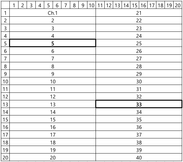
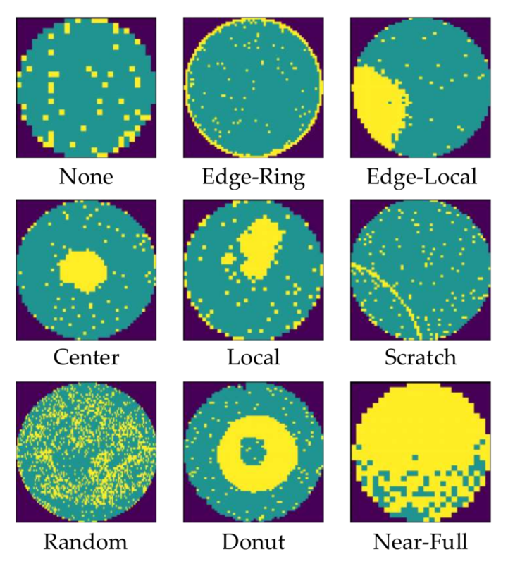
Figure 1. A type of test board used for semiconductor product testingFigure 2. An example of channel layout of a channel-sharing test board. Channels 5 and 33 are defective.
One of the representative test apparatus used for parallel testing is test board, a physical example of which is shown in Figure 1. Hundreds of Devices Under Test (DUT) are mounted onto a test board in a grid-like array, allowing for their simultaneous test within a single test cycle and dramatically reducing overall test time. To further enhance testing efficiency, semiconductor manufacturers developed channel-sharing test boards, which routes electrical signals for testing to multiple DUTs through a single shared channel. They enable increasing test throughput with fewer channels, economizing the costly test channels while significantly improving the efficiency of the testing process. Consequently, channel-sharing architecture is widely employed, particularly in the memory and general-purpose system semiconductor testing fields where cost competition is intense.
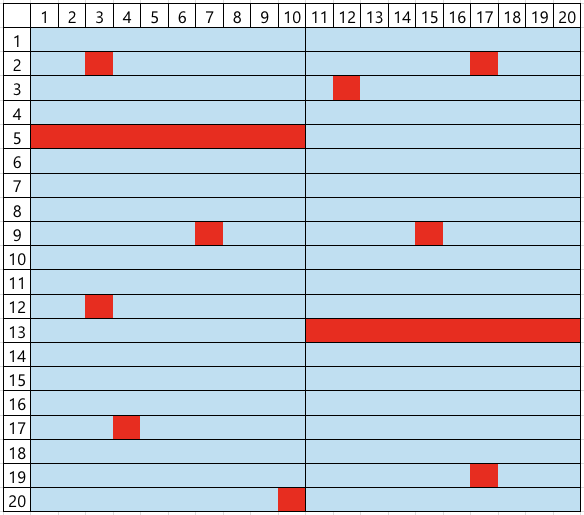
However, this efficient architecture leads to a peculiar and challenging type of false failure, hereafter referred to as Board Channel-Induced Failure (BCIF). This issue is largely due to physical impairments accumulated through repeated test executions, including mechanical wear or micro-cracks of connectors and sockets, which degrade the signal integrity of the shared channel. If such a defect occurs in a specific channel, all DUTs connected to it are erroneously classified as failures, regardless of their actual operational status. For instance, if channels 5 and 33 in the layout shown in Figure 2 are defective, the corresponding DUTMAP, a data representation of test results for each DUT coordinate on the test board, will exhibit a distinct pattern where all DUTs belonging to those channels are marked as failures, as illustrated in Figure 3. Such defective board channels causes the misclassification of potentially good products as failures, consequently decreasing the manufacturing yield and increasing the average production cost.
Figure 3. An example of DUTMAP observed under defects in channels 5 and 33 (blue: good, red: bad)Figure 4. An example of DUTMAP under high failure rate, where it is difficult to confidently determine defects in channels 5 and 33.
To address this issue, engineers in practice perform a manual re-classification by visually inspecting the DUTMAP to identify BCIFs. This work is based on a heuristic inference: if there are some channels where all DUTs are marked as failures while the overall failure rate of the DUTMAP is low, they are considered as BCIFs. This reasoning is predicated on the logic that such a spatial pattern of failures is improbable to occur without underlying channel faults. Conversely, as shown in Figure 4, if the overall background failure rate is high, the complete failure in a channel could plausibly be a coincidental result, which is insufficient evidence to declare BCIFs. Based on this judgment, DUTs suspected of BCIF are scheduled for a re-test on the other test board, affording them a chance to be salvaged as good products rather than scrapped. In contrast, other failed DUTs are scrapped to avoid the additional costs and process delays associated with re-testing.
However, this manual work suffers from several intrinsic limitations. First, it is a labor-intensive task that demands the attention of engineers. Second, the time required for this manual inspection can become a bottleneck, impeding overall test process. Third, the reliance on a qualitative judgment of whether such a spatial pattern is `improbable' introduces subjectivity and inconsistency, as different engineers may apply different criteria. Therefore, there is a pressing need for an automated system to replace this manual re-classification. This necessitates the development of methods to detect whether BCIFs exist in the observed DUTMAP in real-time with high accuracy, so as to improve both the efficiency and yield of semiconductor testing based on channel-sharing test boards.
1.2. Related Work
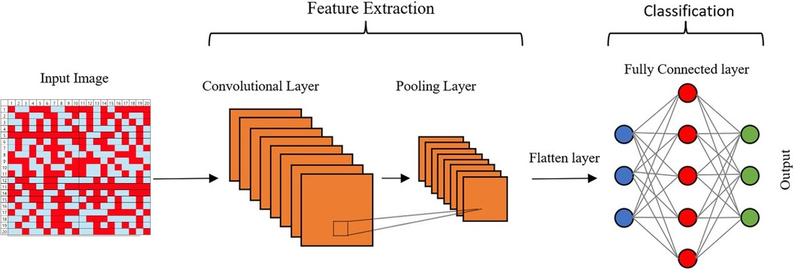
Numerous studies have focused on detecting spatial anomalies in semiconductor test 'map', which is a data representation of coordinate-wise test results such as DUTMAP, using machine learning. In particular, research on wafermap (see Figure 3), which display the test results of individual chips on a wafer, has been actively conducted. While these studies differ in methodological details, many share a common approach of using Convolutional Neural Networks (CNNs) to learn and detect spatial defect patterns within wafer maps [2]. In contrast, research on DUTMAP is comparatively scarce. The method introduced in the patent by [3] is the most relevant prior work to the BCIF detection problem addressed in this study, which also employs a CNN to learn spatial defect patterns in DUTMAPs for anomaly detection.
Figure 5. WM-811K [4], a public dataset prominently used to study semiconductor wafer defect detection
However, these supervised learning-based approaches present several challenges for practical application in industrial settings, which are also pertinent to the BCIF detection problem. First, training deep learning models incurs significant costs associated with acquiring and operating expensive GPU machines. Second, the process of collecting samples and labeling them for a dataset demands substantial effort of engineers in the field. This issue is particularly acute for BCIF detection because a single dataset is insufficient. The spatial pattern of BCIFs, such as the one shown in Figure 4, is contingent on a specific channel layout like that in Figure 2. Since different test boards may have varying channel layouts, the resulting BCIF patterns also change. Consequently, a new dataset must be prepared each time a test board with a new channel layout is introduced. Third, manual labeling is prone to errors, which adversely affects model performance. For instance, when presented with Figure 4, one engineer might label it as a non-BCIF DUT map based on the logic described in Section 1-1. Problem Description, while another might label it as a BCIF. One of these is a labeling error, and a high frequency of such errors will degrade the model's performance as it learns from flawed data.
2. Proposed Methodology
In order to being free from three issues above, we propose an methodology which requires no model training process. This methodology is based on statistical hypothesis testing, and we call it Channel Defect Test (CDT). The core idea is to compute the likelihood ratio between the observed DUTMAP under the 'channel defects' hypothesis versus the 'nomal' hypothesis.
To formulate the test, we begin by mathematically representing the board's channel layout and the DUT failure occurrence structure depending on the presence or absence of channel defects. Representing test board and channels as index sets of their constituent DUTs, the entire board can be expressed as ${1, \ldots, N}$, and the channels as its partitions $C_1, \ldots, C_M$. Taking Figure 2 as an example, the entire board region ${1, \ldots, 20 \times 20}$ is partitioned into 40 channels $C_1, \ldots, C_{40}$. Individual test results of DUTs are represented by variables $x_n \in {0, 1}$ for $n=1, \ldots, N$, where $0$ denotes pass and $1$ denotes fail. The region of channels where all DUTs failed, such as channels 5 and 33 in Figure 2-1, and the region of the other channels are denoted by
$A = \bigcup_{x_n = 1, \forall n \in C_m} C_m \text{ and } A^c = {1, \ldots, N} - A,$
respectively.
Our Goal is to judge whether the observed $A$ is a probabilistic coincidence even in the absence of defective channels, or a structural phenomenon resulting from underlying channel defects. For this purpose, we first model the test results of DUTs as
$x_n \sim \text{Bernoulli}(p_n), \text{ where } p_n = \begin{cases} p_A & \text{for } n \in A \ p_{A^c} & \text{for } n \in A^c \end{cases}, $
$p_A$ and $p_{A^c}$ denote the failure probabilities in $A$ and $A^c$, respectively. In practice, DUTs on a single board are homogeneous products with identical components and manufacturing processes, so we assume they have the equal intrinsic failure probability. CDT tests the following two competing hypotheses for $p_A$ and $p_{A^c}$, which can be interpreted as whether $A$ represents a region of defective channels:
$H_0: p_A = p_{A^c} = p_0 \in (0, 1)$
$H_1: p_A = 1, \, p_{A^c} = p_1 \in (0, 1)$
$H_0$ states that the failure probability in $A$ is not different to that in $A^c$, meaning the observed $A$ is just a probabilistic phenomenon. Conversely, under $H_1$, $A$ represents an area where DUTs fail with probability 1, indicating it is the region of defective channels. These two competing perspectives are intuitively illustrated in Figure 6 and Figure 7, respectively. Rejection of $H_0$ leads to the detection of all DUTs within $A$ as BCIFs, which are then scheduled for re-testing.
An illustration of $H_0$'s perspective on a DUTMAP under the channel layout shown in Figure 2: failures occur randomly with probability $p_0$ across the entire board area encompassing both $A$ and $A^c$ regionsAn illustration of $H_1$'s perspective on a DUTMAP under the channel layout shown in Figure 2: failures occur deterministically in $A$ (area enclosed by orange lines) and randomly with probability $p_1$ in $A^c$
We derive the test statistic of CDT based on Likelihood Ratio Test (LRT) framework. Under $H_0$, the observed $A$ and the number of failures in $A^c$, denoted as $\tilde{x} = \sum_{n \in A^c} x_n$, are the result of failures occurring with probability $p_0$ across the entire board region. Therefore, the resulting likelihood function under $H_0$ is
The multiplicative form of the two $Binomial$ functions stems from the fact that events occurring in $A$ and $A^c$ are independent, which is a direct consequence of the physical isolation between channels. The maximum likelihood estimators for $p_0$ and $p_1$ are their respective sample failure rates [5]: $\hat{p}_0 = \dfrac{|A| + \tilde{x}}{|A| + |A^c|}$ and $\hat{p}_1 = \dfrac{\tilde{x}}{|A^c|}$. By substituting these estimators into the likelihood functions, we can derive the likelihoods ratio as
Finally, we define the test statistic of CDT as the negative log-likelihood ratio, $T(|A|, |A^c|, \tilde{x}) = -\log LR(|A|, |A^c|, \tilde{x})$. Then $H_0$ is rejected if $T(|A|, |A^c|, \tilde{x})$ exceeds a predefined critical value.
3. Experimental Results
Figure 8. The 16 $\times$ 16 channel layout for with 32 channels of 1 $\times$ 8 size, used for all simulations in this study
This section presents simulation studies designed to validate the performance and robustness of the proposed methodology CDT and to demonstrate its practical superiority over the supervised CNN learning. The Data Generating Process (DGP) for the DUTMAP is based on several realistic assumptions.
While all DUTs share a intrinsic failure probability, those within a defective channel are guaranteed to fail.
The number of defective channels and the intrinsic failure probability of the product vary depending on the test board's condition and the product's characteristics.
The location of these defective channels and individual failures is random rather than structurally determined.
In essence, the DGP of a DUTMAP is determined by a combination of two parameters: the number of defective channels and the intrinsic DUT failure probability. For a given pair, a DUTMAP is generated as follows. First, $d$ channels are randomly selected from the total channels $C_1, C_2, \ldots, C_M$, and their union is defined as the defective region $D$, with the remaining area being $D^c$. Subsequently, the test result for each DUT, $x_n$, is generated from a conditional Bernoulli distribution:
$x_n \sim \text{Bernoulli}(p_n) \text{ for } n = 1, \ldots, N, \text{ where } p_n = \begin{cases} 1 & text{for } n \in D \\ p_{D^c} & \text{for } n \in D^c \end{cases}$
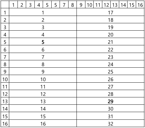
All simulations assume a test board with a channel layout commonly used in the industry, as depicted in Figure 8, where $N = 256$ and $M = 32$.
3.1.Simulation 1: Performance Comparison with a Conventional Method under Realistic Scenarios
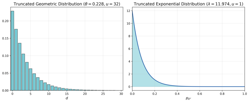
Figure 9. The marginal probability density functions of $$d$$ and $$p_{D^c}$$
The first simulation aims to compare the performance and its stability of CDT and a CNN-based approach under a parameter distribution that mimics real-world manufacturing conditions. We assume $d$ follows a truncated geometric distribution with an upper limit $u = 31$ and a rate parameter $\theta = 0.2283$, pmf of which is denoted as $TruncGeo(d; \theta = 0.2283, u = 31)$. This reflects the reality that the probability of having no defective channels ($$d=0$$) is highest, and it decreases exponentially as the number of defective channels increases. $p_{D^c}$ is assumed to follow a truncated exponential distribution with an upper limit $u = 1$ and a rate parameter $\lambda = 11.9741$, pdf of which is denoted as $TruncExp(p_{D^c}; \lambda = 11.9741, u = 1)$. This captures the observation that the intrinsic failure probability is typically close to $0$ and the probability diminishes as it approaches $1$. The rate parameters for both distributions were set based on internal private data from Samsung Electronics, and their pmf and pdf are visualized in Figure 9. Since the intrinsic product failure probability and the number of board defects are independent, their joint distribution function is the product of their individual distribution functions:
$f(d, p_{D^c}) = TruncGeo(d; \theta = 0.2283, u = 31) \times TruncExp(p_{D^c}; \lambda = 11.9741, u = 1)$
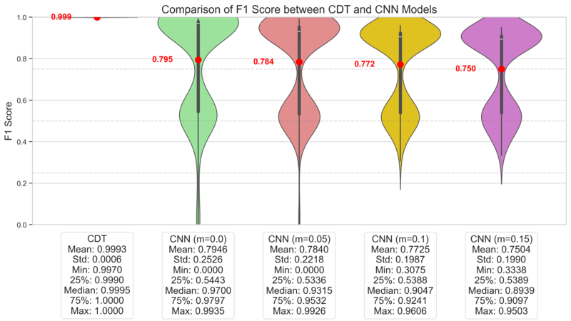
Then DUTMAPs without channel defects, labeled as $y=0$, are generated from $f(d, p_{D^c} | d = 0)$, while those with channel defects, labeled as $y=1$, are generated from $f(d, p_{D^c} | d > 0)$. The experiment consists of 200 independent simulation runs. In each run, we generate datasets for training (10,000 DUTMAPs), validation (2,000 DUTMAPs), and testing (2,000 DUTMAPs), ensuring a balanced 50:50 class ratio for the presence of channel defects, $y$. Performance is evaluated using the $F_1$-Score on the test dataset.
Figure 10. Vanilla CNN architecture for Simulation 1
Layer (Activation)
Output Shape
Parameters
Input
(16,16,1)
0
Channel-wise Convolution (ReLU)
(16,2,2)
18
Max Pooling
(2,2,2)
0
Flatten
(8)
0
Fully Connected (ReLU)
(3)
27
Output (Sigmoid)
(1)
4
Total parameters: 40
Table 1: Layer description of the CNN architecture illustrated in Figure 10
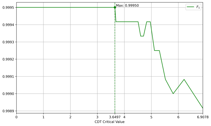
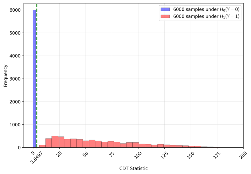
The comparative CNN model employs a simple architecture, as shown in Figure 10 and detailed in Table 1, which is a simplified version of typical small CNN, such as LeNet [6]. One distinguishing feature is the channel-wise convolution, implemented by setting the kernel size and stride to (1, 8), which processes one channel at a time. This design incorporates domain knowledge about the physical independence of channels. To assess the impact of real-world labeling errors, the CNN was trained and evaluated with varying mislabeling rates (0%, 5%, 10%, 15%) in the training and validation sets. In contrast, CDT is a training-free method that only requires setting a critical value. We determined this value to be $3.6497$, the $F_1$-Score maximizer on a generated dataset of 12,000 DUTMAPs with a 50:50 class ratio, as shown in Figure 11. Figure 12 confirms that this critical value perfectly separates the two classes.
Figure 11. $F_1$ Score of CDT by Critical Value (solid line) and the Maximizing Point (dashed line)Figure 12. Sample Distribution of CDT Statistic $T$ and Critical Value (green dashed line)Figure 13. Performance evaluation results in Simulation 1
Figure 13 displays the $F_1$-Score distributions for both models over 200 runs. CDT consistently achieves high $F_1$-Scores with low variance, demonstrating stable and high performance. In contrast, the CNN's $F_1$-Score distribution is distinctly bimodal, indicating high variance. This suggests that the CNN's success is highly dependent on the specific dataset composition, undermining its reliability. The lower-performance mode likely corresponds to runs where sufficient training failed. Even when considering only the high-performance mode, the CNN is inferior to CDT in both average performance and stability. Even if the CNN's architecture or learning techniques were improved, its significant computational cost would remain a disadvantage, making CDT a more practical choice.
This outcome stems from the nature of the data. The random location of defective channels means there are no consistent local spatial patterns for a CNN to learn, making DUTMAPs inherently difficult for CNNs to classify. A more reasonable perspective is to view a DUTMAP not as an 'image' with spatial patterns, but as area-wise 'count' data ($|A|, \tilde{x}$). CDT is the direct implementation of this viewpoint.
3.2.Simulation 2: Robustness Analysis
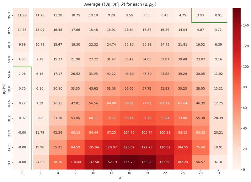
The second simulation evaluates the robustness of CDT by assessing its performance across the entire parameter space of $(d, p_{D^c})$. We generated 100 DUTMAPs for each $(d, p_{D^c}) \in {0, 1, \ldots, 31} \times {3.125\%, 12.5\%, \ldots, 96.875\%}$ and computed the average of the CDT statistic $T(|A|, |A^c|, \tilde{x})$.
Figure 14. Heatmap of the average test statistic $T(|A|, |A^c|, \tilde{x})$ across the parameter space of $(d, p_{D^c})$ and decision boundary (green line) based on the critical value $3.6497$, determined in Section 3.1. Simulation 1
The results are presented as a heatmap in Figure 14. The green line represents the decision boundary where the average CDT statistic equals the critical value of $3.6497$ determined in Section 3.1. Simulation 1. Two areas of vulnerability were identified:
False Postive Area: where $d=0$ but $p_{D^c}$ is high (e.g., $\ge 68\%$): - In this area the high failure probability leads to $A$ of random failures that are mistaken for the region of defective channels.
False Negative Area: where both $d$ and $p_{D^c}$ are extremely high: - Here, the signal from the channel defect is obscured by the overwhelming noise from background failures.
Both vulnerability zones correspond to scenarios with extremely low yield. In a real-world manufacturing context, such conditions would likely halt production for root cause analysis and yield improvement, rather than proceeding with mass production. Therefore, these two scenarios are of little practical concern. The results demonstrate that CDT is a robust methodology within the vast majority of the parameter space, which corresponds to almost realistic manufacturing environments.
4. Conclusion
This study proposes Channel Defect Test (CDT), a training-free statistical hypothesis testing method to detect BCIFs on channel-sharing test boards. CDT computes the likelihood ratio between the structural channel-defect hypothesis and the global-random-failure hypothesis using only the observed DUTMAP and the known channel layout. Simulations demonstrate that CDT achieves high detection performance and stability across realistic manufacturing conditions. Vulnerabilities appear only under extreme scenarios with very high background failure rates or many simultaneous defective channels, which are of limited practical concern.
Figure 15. CNN-based 'Fat' System for BCIF processing
In contrast to CNN-based systems that rely on engineers and a GPU server, as shown in Figure 15, CDT substantially reduces deployment cost and operational complexity. Since the only cost to CDT is the computation of Equation 1, CDT can run in real time on low-end CPUs. This allows it to be embedded as lightweight software in test equipment to detect BCIFs immediately after testing and automatically trigger re-test procedures, as illustrated in Figure 16. This streamlined arrangement is expected to significantly reduce maintenance costs and processing delays. Given the relative lack of prior work on DUTMAP-based BCIF detection, CDT offers a practical, resource-light alternative and a leading approach for accelerating field deployment in this domain.
Figure 16. Proposed CDT-based `Slim' System for BCIF processing
References
1. Stefan R Vock, OJ Escalona, Colin Turner, and FJ Owens. Challenges for semiconductor test engineering: A review paper. Journal of Electronic Testing, 28(3):365–374, 2012.
2. Tongwha Kim and Kamran Behdinan. Advances in machine learning and deep learning applications towards wafer map defect recognition and classification: a review. Journal of Intelligent Manufacturing, 34(8):3215– 3247, 2023.
3. KIM Keunseo, LEE Jaecheol, YANG Minkyu, JANG Jinsic, et al. Method and apparatus with test result reliability verification, March 13 2025. US Patent App. 18/828,022.
4. Ming-Ju Wu, Jyh-Shing R. Jang, and Jui-Long Chen. Wafer map failure pattern recognition and similarity ranking for large-scale data sets. IEEE Transactions on Semiconductor Manufacturing, 28(1):1–12, 2015. doi: 10.1109/TSM.2014.2364237.
5. George Casella and Roger Berger. Statistical inference. Chapman and Hall/CRC, 2024.
6. Yann LeCun, L´eon Bottou, Yoshua Bengio, and Patrick Haffner. Gradient-based learning applied to document recognition. Proceedings of the IEEE, 86(11):2278–2324, 2002.
* Swiss Institute of Artificial Intelligence, Chaltenbodenstrasse 26, 8834 Schindellegi, Schwyz, Switzerland
Abstract
This study investigates the performance of direct-selling salesman branches, pointing out the limitations of existing analyses that focus predominantly on quantitative factors (e.g., headcount, market size), and aims to empirically identify the influence of a qualitative factor—namely, "relationships" (i.e., informal interactions among members within the branches)—on performance. The core assertion is that the performance of salesmen is not a set of mutually independent events, but rather a dependent relationship where they influence each other through relational networks such as information exchange and cooperation with colleagues.
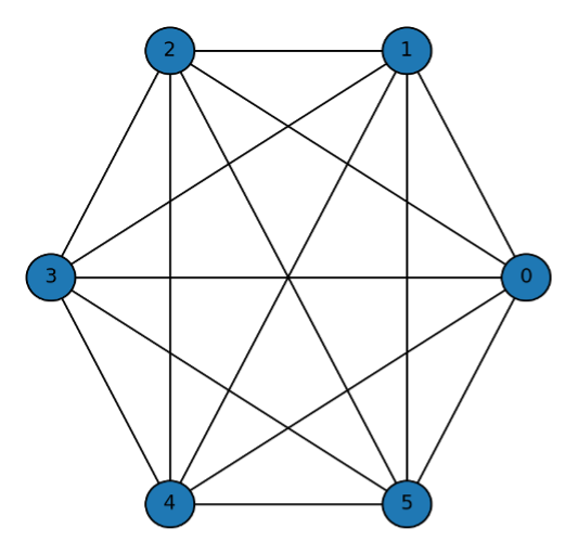
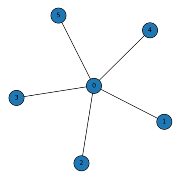
To analyze this, we first confirmed the existence of a nonlinear effect of branch headcount on performance through regression analysis. Furthermore, we utilized the Symmetric Connection Model (Jackson & Wolinsky,1996) to estimate the structure of the organizational 'relationships' that cause this nonlinearity. Based on the benefits and costs associated with relationship formation, this model estimates whether each branch adopts a Complete, Star, or Empty network structure. To estimate the variables required for the model, we assumed that information regarding benefits and costs is contained within the residuals of the regression analysis and then calculated the relational benefits and costs for each branches.
The analysis results showed that approximately 52% of the total branches formed a 'Complete' structure with dense mutual connections, while 40% formed a 'Star' structure mediated by a central figure acting as a hub. Conversely, about 8% of the branches were estimated to have an 'Empty' structure with minimal interaction among members. This suggests that the synergistic effects of the branch may be difficult to achieve when the costs of relationship formation are high (e.g., due to low meeting attendance), even if the headcount is large.
This study is significant in that it quantitatively measured the branch’s previously unseen 'synergistic effect' and provided an analytical framework. The findings can contribute to companies establishing effective operational strategies that consider qualitative aspects, such as personnel reallocation and incentive design, to maximize organizational performance.
Traditional Korean companies have grown through a sales system called door-to-door sales (or direct sales). In this system, a salesman sells the company's products to potential customers in various locations rather than a designated place of business. Generally, this predominantly involves sales pitches to people with whom the salesman has a pre-existing relationship, such as family or friends. Upon completing a sale, the salesman is paid a fixed commission from the company corresponding to the sold item. Consequently, the structure dictates that no compensation is received if no sales are made.
Meanwhile, the salesman is mandatorily affiliated with the company's smallest organizational unit (hereinafter referred to as a 'branch'). A branch consists of the group leader and a group of other salesmen. They become colleagues who engage in active interaction, such as gathering at the office every morning for meetings or attending workshops together. Naturally, they exchange information regarding their sales activities. They also attempt to secure additional potential customers by recruiting new individuals to join the branch as salesmen.
For companies operating such a door-to-door sales system, the primary concern would be how to maximize sales performance. The easiest approach is to observe the differences between high-performing and low-performing branches within the company. For example, one might compare various aspects such as the number of salesmen in the two branches, their primary operating regions, or the presence of star performers. In conducting such business analyses, experience suggests that practitioners in the field tend to focus mostly on quantitative factors (headcount, market size). While quantitative factors cannot be ignored, qualitative factors must also be considered when analyzing interactive, organic entities. This is because performance cannot simply be reproduced even if the quantitative factors are identical.
1.1. Problem Statement
Therefore, considering only quantitative factors in organizational research is insufficient for conducting proper analysis. This is because the performance of the salesmen who constitute the organization can hardly be viewed as a set of mutually independent events. Even when conducting regression analysis, if there are dependent variables, reliable analysis is possible only after additional preprocessing. Similarly, if the performance of the salesmen composing the organization is currently dependent, explaining it solely through simple quantitative variables is prone to misunderstanding.
To assert that salesmen's performances are mutually independent events requires a major assumption that there is absolutely no interaction between the salesmen. However, considering the activities occurring within the door-to-door sales system described earlier, this is likely a rare or exceptional circumstance. In the real world, most organizations (consisting of two or more people with the same goals/interests) involve mutual interaction. Therefore, the main direction of this study is to uncover the informal interaction structure nested within the institutional/formal structure of being assigned to a branch from the start.
1.2 Purpose
The purpose of this paper is, therefore, to provide an idea of how to capture and utilize the informal interactions of salesmen for analysis. In other words, this study will be a process of empirically demonstrating the organization's 'synergistic effect' that has previously been only a conceptual idea, thereby providing valuable business insights.
2. Theoretical Framework
The performance of an organization is determined not only by individual abilities but also by how members are connected and interact with each other. In particular, when the connections among members are strong and information exchange occurs smoothly, the organization can achieve high performance through synergy. On the other hand, when connections are weak or fragmented, communication costs increase, and efficiency decreases.
In practice, quantitative factors such as the number of members, average sales per person, and regional variables have mainly been used to explain performance. However, these factors are insufficient to explain the differences in outcomes that occur even among branches with similar numbers of people. In reality, even when the number of people is the same, performance differences arise depending on the structure of relationships..
To theoretically explain these relational effects, this study adopts the Symmetric Connection Model. This model explains the relationships between individuals within an organization as a network of connections, in which each member decides whether to maintain relationships with others based on the trade-off between benefits from connection and costs of maintaining the relationship. According to this model, the overall utility of the organization is determined by the sum of the benefits gained through connections among members, minus the costs associated with maintaining these relationships. Formally, if the benefit obtained from connecting with another member is denoted as $\delta$, and the cost of maintaining that connection as $c$, the utility of member $i$ is expressed as follows:
where $d(i,j)$ represents the shortest path between members $i$ and $j$. In this model, as the number of members increases, the total potential connections increase exponentially, but so do the costs of maintaining them.
Based on this model, three representative types of network structures can be derived: Complete Network, Star Network, and Empty Network. A Complete Network is a state where all members are interconnected, showing the highest level of cohesion. A Star Network is one where a few central members are connected to many others, while peripheral members are not directly connected. An Empty Network represents a situation where there are almost no connections among members. For a detailed derivation of the criteria and the formal conditions defining the Complete, Star, and Empty network types, please refer to Appendix A.
3. Methodology and Research Model
This study aims to empirically identify the relational effects that exist within sales branches. To achieve this, actual sales data from a domestic direct sales company were analyzed, and quantitative analysis was conducted to verify the impact of relational structures on sales performance.
3.1. Data and Variables
The data used in this study consist of branch-level information from a nationwide sales organization. The main variables include branch-level sales, number of salesman (headcount), attendance frequency, and regional information.
Sales (dependent variable): The total sales generated by each branch.
Headcount (independent variable): The number of salesman belonging to each branch.
Meeting Frequency: The average monthly frequency of meeting attendance by branch members.
Region: Dummy variable controlling for regional differences.
In order to ensure comparability among variables, logarithmic transformation was applied to both sales and headcount. This also allows for interpreting the estimated coefficients as elasticities.
3.2. Empirical Model Specification
The empirical model used in this study consists of two stages. First, the non-linear relationship between the number of members and sales performance is estimated through regression analysis. Second, based on the residuals from this model, network structures are inferred to identify relational effects that cannot be explained by size alone.
If the coefficient $\beta_2$ is statistically significant, it implies the existence of a non-linear relationship between branch performance and headcount, in addition to a simple linear relationship.
3.3. Estimation of Relational Effects
After estimating the above model, the residuals ($\epsilon_i$) are analyzed to capture performance differences not explained by quantitative size alone. These residuals are regarded as the outcome of relational effects within each branch, which are defined by the trade-off between the benefits gained from connection and the costs of maintaining those relationships.
To formalize this relational aspect, the Symmetric Connection Model is applied. Each branch is modeled as a network consisting of N members, and its performance is determined by the combination of connection benefits and maintenance costs. Based on the estimated coefficients, branches are categorized into three network types — Complete, Star, and Empty networks — as proposed in the theoretical framework.
Complete Network: $c< \delta - \delta^2$
Salesmen within the same branch are closely interconnected with one another.
Figure 1. Complete Network
Star Network: $\delta - \delta^2 < c < \delta + \frac{N-2}{2} \delta^2$
A branch structure where relationships are centered around one key salesman.
Figure 2. Star Network
Empty Network: $\delta + \frac{N-2}{2} \delta^2$
A structure where members belong to the same branch but engage in sales activities individually, without forming relationships with each other.
Figure 3. Empty Network
3.4. Cohesion Index (CI)
The regression analysis model and the Connection Model allowed us to identify the efficient network structure for each branch. However, it would be a much simpler and easier method if we could estimate the status of a branch through a simple indicator rather than performing this process repeatedly. The crucial difference between the Empty network and the Star/Complete networks can be distinguished by the presence or absence of relationships. Therefore, if we can determine the strength of relationships for each branch, we can classify whether that branch has existing relationships or whether its relationships are weak or nonexistent. We aim to reveal this through a metric called the Cohesion Index.
Cohesion Index (CI) is defined as follows:
$${CI}_{i} =\frac{\text{Observed Attendance}_{i}}{\text{Expected Attendance}_{\text{by group size}}} $$
If a branch shows a high CI value, it can be inferred that it has strong relationships and thus corresponds to either a Star or Complete Network. Conversely, a low CI value indicates that the branch is likely to have an Empty structure.
4. Results
4.1. Regression Analysis Results
The results of the regression analysis are presented in Table 1. In Model (2), the linear relationship between the number of members and sales performance was estimated, and in Model (3), a quadratic term was added to identify non-linear effects. (Standard errors are displayed in partentheses.)
Model
Results
$R^2$
(2)
$log() = .72 + 1.25 log()$
.75
(3)
$log() = .52 + 2.07 log() - 0.61 [log ]^2$
.78
Table 1. Regression Results for Linear and Non-linear Relationships between Headcount and Sales
As shown in Model (3), the coefficient of the quadratic term is significant, confirming the existence of a non-linear relationship between headcount and sales performance. The negative sign implies that while increasing the number of members initially improves performance, after a certain threshold, relational and coordination costs begin to increase, reducing overall efficiency. Therefore the number of people does not guarantee higher performance.
This situation is self-evident when considering the real-world context. The Data Generation Process for the number of salesmen in an branch increases as an active salesman recruits their acquaintances or family members to join the branch they belong to. In such cases, the bond between them is established, and the new members become incorporated into the existing relational network of the branch and begin to interact. Ultimately, it is this relationship that induces nonlinearity. The maximum possible number of relationships among individuals in an organization can be expressed as $N^2/2$. This is why the quadratic term was added earlier—it was a method to capture these 'relationships'.
4.2. Symmetric Connection Model Results
Through the preceding results, we have confirmed the existence of a nonlinear effect of the number of salesmen on organizational performance. The question then becomes: how can we capture the structure of these internal organizational relationships that gives rise to this effect? Before addressing this, let's briefly examine how relationships can be linked to performance. Salesmen typically sell to people they already know. Therefore, regardless of how large one's personal network is, there is a clear limitation to long-term revenue generation. While there are various ways to expand relationships, one method is to utilize relationships of relationships. That is, expansion occurs not only through directly connected relationships but also through connections linked to those relationships. Similarly, bringing in new salesmen allows for the expansion of relationships, which secures information—potential customers—that can lead to increased performance. This type of information necessarily moves through interactions between connected salesmen; that is, through relationships.
One way to understand how salesmen within an organization are connected is to observe the extent of their mutual exchange. This might involve tracking who calls whom, how often they talk per week, the topics of their conversations, or whether they participate in company meetings or workshops together. However, collecting such data is challenging, and some parts may involve sensitive personal information, making them unsuitable for analysis.
Therefore we aim to identify the relational configuration of each salesman organization using the Symmetric Connection Model. To apply this model, two variables must be estimated: the benefit and the cost components. To do this, we include the existing headcount term along with regional dummy variables to control for the varying market size effects across different regions
The fundamental assumption in estimating these variables is that the residual term, $\epsilon_i$, left after controlling for headcount and operating region in the preceding regression Equation (5), captures the unexplained performance variation. This variation is assumed to contain the necessary information to derive the two parameters we seek: the connection benefit $\delta$ and the relationship maintenance cost $c$.
Therefore, from these variables, we can estimate the benefit and cost of forming relationships among salesmen for each branch. Examining the cost component first, it arises from establishing relationships. Spending time—such as regularly meeting for meals or talking on the phone—all contributes to the cost of maintaining that relationship. If so, let's consider the unique cost incurred by a salesman to maintain relationships with other salesmen. This involves the morning meeting, which was introduced earlier. Attending this meeting provides an excellent opportunity to form relationships with other salesmen without spending extra time or money. Hence, if a branch's meeting frequency is high, it can be rephrased that the aforementioned cost is 'low'.
Since morning meetings are held 20 days per month uniformly across all branches, the average meeting attendance frequency for each branch can be estimated without bias based on this. To represent the cost component, we introduce a variable for 'the number of days meetings were not attended'. After controlling for this variable that allows us to estimate the cost, the residual term should contain only the information regarding the benefit salesmen gain through relationships. Here, we assume that the distribution of the residual term does not follow a specific probability distribution, but we exclude a Uniform distribution. The reason for excluding a Uniform distribution is that it is highly unlikely to occur in the real world (as it would imply that all salesmen have identical degrees).
$$ c_i = \epsilon_i = \tau_i$$ - Equation (7)
$$\delta_i = \tau_i$ - Equation (8)
Finally, the cost component can be estimated from the differences between the respective residual terms. Lastly, in order to comply with the data range required by the Connection Model for application, we perform min-max scaling on the calculated benefit and cost values.
After undergoing the calculation process described above, the most efficient network type for each branch is determined based on the relationship between the calculated benefit and cost. Representative real-world cases for each type can be observed in Table 2.
Network Type
Group Information
Graph
Complete
Headcount: 10 Region: South Gyeonggi Attendance: 16/20 Sales: 120
$c = 0.03$, $\delta = 0.42$, $\delta^2 = 0.18$
$\delta + \delta^2 > c$
Empty
Headcount: 6 Region: South Gyeonggi Attendance: 8/20 Sales: 38
$c = 0.47$, $\delta = 0.27$, $\delta^2 = 0.07$
$\delta + \frac{\delta^2 (N-2)}{2} < c$
Star
Headcount: 8 Region: South Gyeonggi Attendance: 12/20 Sales: 65
$c = 0.36$, $\delta = 0.35$, $\delta^2 = 0.06$
$\delta + \frac{\delta^2 (N-2)}{2} > c$
Table 2. Actual network cases
In the case of the first branch, salesmen diligently attend meetings, leading to relatively low costs associated with forming relationships, while the benefits derived from forming relationships are also high. Therefore, a Complete Network structure is efficient because the benefit gained from direct connection with each other outweighs the cost for salesmen.
In the case of the second branch, the salesmen's attendance rate is low, resulting in high costs for establishing mutual relationships. If they were to form relationships, they would need to spend separate time and money on external venues, making the cost relatively high. Consequently, they conduct their sales activities individually, meaning this branch is highly likely to experience turnover once salesmen exhaust their personal network of potential customers.
In the case of the last branch, the cost is not as high as the second case, but direct relationship formation is not efficient. However, since there are indirect benefits to be gained, they do not forgo relationships entirely but instead form a structure where connections are made only with a member who acts as a hub among the salesmen.
4.3. Cohesion Index
Based on these cases, we can intuitively confirm that the relational structure is determined by the organization's 'cohesion'. Therefore, by 'Cohesion Index', we can easily differentiate between organizations with and without relationships. Of the three variables utilized in the preceding Connection Model, the benefit component cannot be arbitrarily changed, allowing us to derive this new variable based on cost and headcount. As shown in the table below, classification can be made based on salesman headcount and meeting attendance frequency. A branch exhibiting high cohesion would likely correspond to either a Complete or Star Network.
To quantitatively calculate cohesion, various methodologies exist. For instance, the attendance (or non-attendance) of salesmen within a group over a month could be modeled using a binomial distribution, which could then be used to represent the probabilistic frequency based on the group's headcount. Subsequently, a cohesion score could be calculated against a specific threshold (calibration). However, instead of deep calculations, we aim to calculate this using a simpler method here. We base our approach on the fundamental idea that a larger group headcount may lead to a lower frequency of meetings. We categorize the groups into histogram-like bins based on headcount, and then determine the cohesion score by assessing if a group's meeting frequency is lower than the average frequency(=Expected Attendance) of its respective bin. This approach is considered reasonable as it somewhat compensates for the difficulty of frequent meetings in groups with a high number of members.
Headcount
Expected Attendance (= Avg. Frequency)
# of branch
1~ 5
14
87
6~7
13
68
8~10
13
87
+11
12
67
Table 3. Group size of expected attendance
By using this method, we can find an example that re-emphasizes that the initial assumption of independence was flawed: the example of a group with a large headcount but a low cohesion score. The headcount of this group is in the top 10% of all groups. However, the salesmen's low attendance results in high costs for forming relationships, and the benefits are also low. Consequently, it can be concluded that they operate their sales activities individually, without forming mutual relationships. For the company, as synergy does not occur in such an organization, considering the next steps—such as reallocating active salesmen to other groups—would be advisable.
Network Type
Group Information
Graph
Empty
Headcount: 13 Region: South Gyeonggi Attendance: 7/20 Sales: 62
$c = 0.46$, $\delta = 0.09$, $\delta^2 = 0.008$
$\delta + \frac{\delta^2 (N-2)}{2} < c$
Table 4. Antithesis: Why a Large Headcount Doesn't Guarantee High Performance
5. Conclusion
This study analyzed the performance of sales branches by focusing on relational effects among members. Unlike stereotype of the business that mainly explained performance through quantitative factors such as headcount or market size, this study incorporated a relational perspective to empirically examine how the structure of relationships among members affect overall performance.
These results demonstrate that the relational structure within an organization plays a critical role in determining its overall performance. In particular, cohesive networks enhance communication and cooperation, which improves the efficiency of information sharing and task execution. In contrast, fragmented networks increase relationship costs and make the organization vulnerable to inefficiency.
From a practical perspective, the results provide implications for managing sales organizations. Managers should not only focus on increasing the number of members but also design and maintain internal relationship structures that promote cooperation and cohesion. Maintaining an optimal team size and fostering internal connectivity may lead to higher organizational performance.
In addition, branches with low cohesion should be managed through interventions that strengthen relationships among members, such as team meetings, mentoring programs, and leadership-centered communication structures. Using the Cohesion Index (CI) proposed in this study, managers can regularly diagnose the relational health of branches and implement improvement measures accordingly.
While this study is significant for proposing an analytical framework that integrates the qualitative aspect of relational effects into performance analysis, it has several limitations that also suggest avenues for future research.
First, a core methodological approach of this study is the use of regression residuals to estimate relational benefits $\delta$ and costs $c$. This approach is predicated on the novel assumption that the performance variance unexplained by quantitative factors contains embedded information about relational dynamics. However, this is a strong assumption and constitutes a key limitation, as the residuals may also capture the effects of other unmeasured variables. Therefore, the estimated values for benefits and costs should be interpreted with caution as indicators of relational effects rather than precise measurements. Future research could focus on methodologically complementing this approach to validate or refine these estimations.
Second, the study is constrained by the inherent limitations of the Symmetric Connection Model itself. The model assumes that two salespeople in a relationship derive the exact same benefit and incur identical costs. This is a simplifying assumption that, while making the analysis tractable, may not fully capture the complexity of real-world interactions. In practice, organizational relationships are often asymmetric, with one party bearing greater costs or deriving different utility. Future studies should therefore explore the application of asymmetric models to investigate how unequal benefit-cost structures alter the formation of organizational networks.
Finally, there is a limitation related to the proxy variable used for relationship formation costs. This study utilized the branch's 'meeting attendance frequency,' which primarily reflects the 'quantity' or 'opportunity' for interaction rather than its 'quality.' High attendance does not necessarily equate to effective communication, and vice versa. This poses a limitation in fully explaining the cost of relationship formation. Consequently, future research would benefit from collecting more direct, qualitative data through methods like surveys to measure aspects such as relationship satisfaction or trust, thereby providing a more nuanced understanding of relational dynamics within the organization.
Appendix A. Illustration of the Symmetric Connection Model
To provide an intuitive understanding of the theoretical framework applied in this study, this appendix briefly illustrates the Symmetric Connection Model (Jackson & Wolinsky, 1996) using simple network cases. This model assumes that each agent decides whether to form or maintain links with other agents by weighing the benefits of connection against the costs of maintaining those links.
Here, $\delta$ represents the decay parameter that discounts the benefit as the network distance between two agents increases, and $c_{ij}$ denotes the cost incurred by maintaining a direct link between agents $i$ and $j$. The first summation term represents the benefit gained through both direct and indirect connections, while the second term represents the cost associated with direct connections.
General Case 1: Complete Network
A complete network is one where every agent is directly connected to every other agent. For a complete network consisting of n agents, each agent maintains $n-1$ direct links. The distance to any other agent is $1$. The utility for any single agent $i$ is the sum of benefits from $n-1$ connections minus the cost of maintaining those $n-1$ links:
$$u_i = (n-1) \delta - (n-1) c$$
The total utility of the complete network is the sum of utilities for all $n$ agents:
Interpretation : This structure maximizes direct information flow and cohesion. However, its total utility is highly sensitive to the cost $c$, as the number of links, $n(n-1)/2$, grows quadratically with the number of agents. This network is efficient only when the net benefit per connection $(\delta-c)$ is sufficiently high
General Case 2: Star Network
A star network consists of one central agent connected to all other $n-1$ peripheral agents, with no links between the peripheral agents themselves.
The utility of the central agent, who maintains $\(n-1\)$ direct links, is:
$$u_{center} = (n-1) \delta 0 (n-1) c$$
The utility of any peripheral agent is different. They have one direct link (to the center, distance 1) and $(n-2)$ indirect links (to other peripherals, distance 2). The utility is:
Interpretation: The star network is a more cost-efficient structure than the complete network, especially when connection costs $c$ are moderate. It relies on a central hub to facilitate information flow, which makes the network efficient but also vulnerable to the removal or failure of the central agent.
General Case 3: Empty Network
An empty network is a state where no links exist among the agents.
In this structure, no agent has any connections. Therefore, they receive no benefits and incur no costs from the network. The utility for any single agent $i$ is:
$$u_i=0$$
The total utility of the empty network is consequently zero:
$$U_{empty}(g)=0$$
Interpretation: This structure represents the baseline scenario of no interaction or cooperation. It typically emerges when the cost of forming a single link $c$ is higher than the benefit $\delta$ that can be derived from it, providing no incentive for agents to connect. It signifies a complete lack of organizational cohesion.
References
1. Jackson, M.O. and Wolinsky, A. (1996) ‘A strategic model of social and economic networks’, Journal of Economic Theory, vol 71, No. 1 pp 44–74.
Tariffs with India, Korea, and Switzerland endanger student mobility and research in the learning economy
Trade deals must lock in visa certainty, protected lab inputs, and joint research
Bake education into trade to keep talent flowing and innovation alive